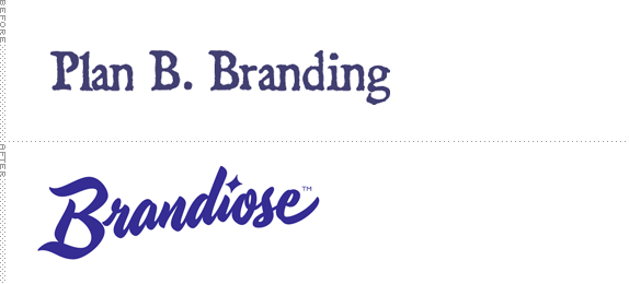
Established in 2000 as Plan B Branding by life-long friends Jason Klein and Casey White, Brandiose, as the new company has been named, is a branding firm focused on designing official logos and uniforms for Minor League Baseball teams with awesome names like the Lehigh Valley Iron Pigs and the Richmond Flying Squirrels. Having been called to the Majors, they also revitalized the Cincinnati Reds logos and uniforms. With the new name comes a new identity with lettering by Ken Barber.
The Brandiose signature pays tribute to the mid-century lettering that captured an optimistic, utopian view of America. Nobody crafts these playful and whimsical scripts quite like Ken. Ken also worked to infuse our own personality traits into the signature, by reverse-engineering American graphology."
— Brandiose project description
Co-founder Casey White on the name change.
It's fun to focus, for a change, on the design of a design firm rather than a company, product, or service. I usually end up avoiding them because they are typically pretty mild affairs. But when you are trying to land fun projects like Minor League logos and uniforms, you have to step up to the plate, if you know what I mean — of course you know what I mean, because that's the lamest punchline ever.

The old logo was pretty weird. Not weird as in what it may mean or it being too out there. It just seemed like the least appropriate type selection for a fun, sports-focused company. Plus, it wasn't really that nice to look at. The new wordmark is a perfect fit not just for what the firm does but for the name too. It's got glitz and flair. It looks and feels like it doesn't take itself too seriously but is conscious that it has to look good and make the teams that hire them feel like it's all going to rub off. While it's usually easy to pick apart wordmarks for strange characters or poor spacing, it's a harder case to crack when it's been executed so tightly by someone like Ken — everything flows and pairs perfectly. I also love the cheeky post-rationalization below.


The new identity program also includes Brandiose's new masthead, "Sophie the Scribbler." The heroine pays tribute America's can-do spirit, and draws inspiration from mid-century advertising characters by artists like Pete Hawley.

Sophie the Scribbler.
Not sure about the need for Sophie. Seems almost gratuitous. I like the idea of mixing pin-up and sketching and baseball into one heroine, but there is something, let's say, off-brand about her. While the logo instantly reminds me of mid-century Americana, Sophie has a rubbery, 3D-program look to her that doesn't quite match the spirit of the wordmark. Nonetheless, she's a fun element of the identity and it signals right away that Brandiose can do mascots. Overall, it's nice to see a design firm treat its identity with more panache than just picking a sans serif and calling it minimal.

Don't forget to cast your vote about this post online
