Established in 1932, the New Theatre is a proudly independent theater in Sydney, Australia. "We're not slick, we're not refined and we don't conform," is only one of many statements it makes, "We believe in artistic and social expression, not just escapism. When we take the stage, we're for real." Or "We're driven by passion, not money." You get the point. This past January, New Theatre introduced a new visual and verbal identity created by the Sydney office of Interbrand.
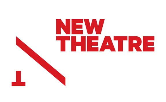
At the centre of it all, a new logomark referencing unexpected twists and turns in the form of an 'NT' device, that stems from the word mark. The logo combines the three initial letters of The New Theatre into one simple mark. The unique mirrored structure of the mark allows applications and messaging to be rotated. The device is used to communicate the theatre's aims for constant reinvention, transitions and alternative viewpoints. It allows New Theatre to sit proudly at the centre of their productions, literally stamping them and claiming them as their own. The idea of 'new' collaborations with local businesses and the community also comes to life through product and event partnership.
— Interbrand project page
Brand video.


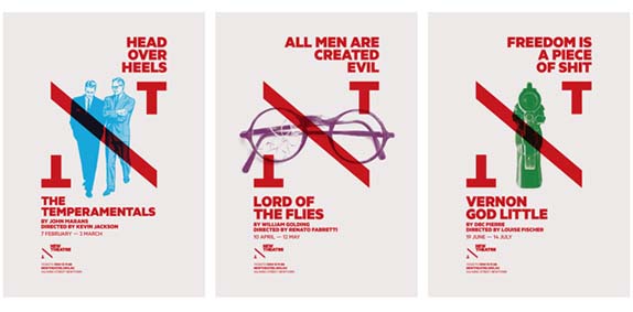
The old logo was not as terrible as one might think of a splatter-based logo; with the lowercase italic and contrasting color combo it did manage to convey being an independent and edgy theater but not much more positive can be said about it. The new logo and identity are fantastic and amazingly smart and clever. The "N" monogram on its own is instantly readable as an "N" and having its slab serifs be the "T"s of the name is great. On top of that, the "N" with the wordmark works perfectly to cement the concept and execution. The rest of the identity is wittily crafted and executed from pins to restroom signage. It's early in the year, but this is one of my favorite projects so far.

Play posters, above. Postcards, below.


Don't forget to cast your vote about this post online
