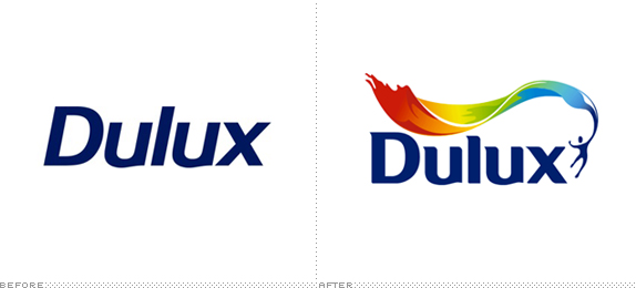
Dulux, owned by Dutch multinational conglomerate AkzoNobel is an international brand of paint with a history dating back to 1931 which, during its lifetime, has been sold by Dupont and former British chemical company ICI. Initially aimed at wholesalers and decorators the brand moved into the retail market during the 1950s and delivered a significant (and memorable) advertising impact with the introduction of the "Dulux dog" as part of a 1960s advertising campaign which continues to be used today. Following a decision to resolve the international variations of Dulux into one premium paint brand, October 2010 saw the initial launch of a new global visual identity system created by London-based Design Bridge across Canada, China, India, South East Asia, the Pacific and the Netherlands with other regions to follow.

[…] This harmonising identity would need to work across 14 existing brand names in 50 local markets, in every format and application, from simple business cards to point of sale, livery and major advertising campaigns.
International creative collaboration between our studios produced a new identity symbolised by the iconic, energising Flourish logo and motivational strapline: "Let's Colour". This universally understood shorthand liberates creativity by opening consumers' eyes to the transformative power of colour.
— Design Bridge Case Study


The previous logo was a straightforward but competent typographical construction with a distinctive "U" character that neatly paired with the "l" and "x". The use of bold italics delivered a fairly conventional sense of motion but appropriately resolved the product's swift application and durability. Reliable but certainly not inspiring. In contrast Dulux's new global identity is bursting with bright colours and rhythm that feels positive, creative and inclusive. It understands today's home decor/DIY market as one of frequent change and self-expression and as such delivers a positive "can do" message through the dynamic posture of a hero-like character and billowing flag aesthetic that implores consumers to go forth and colour.

The wordmark, developed by freelance designer Rob Clark (and created as a complete and proprietary typeface), resolves the same visual messages of the previous identity but in a far more understanding and accessible manner through its smooth curves and windswept terminals. The lock-up has a smart balance of positive and negative space, the "hero" is well placed and carries the direction of the "x" well and together with the wind swept banner deliver a strong forward momentum.

I'm really impressed by the bold duality of this identity in its smart contrast of geometric, organic, and anthropomorphic visual styles. For me it neatly balances the world of functionality with that of the cosmetic with a simple modular build that neatly resolves all the international variations. I see the identity as a smart representation of personal expression, practicality, and global inclusivity (and perhaps diversity) that ties in neatly with the "Let's Colour" campaign.
4-minute summary of the "Let's Colour" initiative.

Don't forget to cast your vote about this post online
