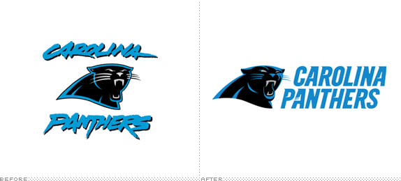
Joining the NFL as an expansion team in 1995, the Carolina Panthers have a total record of 131 wins and 150 losses and have even made it to the Super Bowl (XXXVIII in Houston) in which they lost to the New England Patriots. Over the weekend, which happened to be Pro Bowl weekend, the Panthers introduced a new logo designed by the NFL's creative department.
The updated identity reflects a modernized version of the previous logo and logotype and visually connects the two together. It has been designed to provide a more aggressive, contemporary look to the logo while making it more three-dimensional for ever-increasing digital use. […]
The white outline around the logo has been removed to create a more dimensional feel and to keep the focus on the features of the panther.
— Press Release

Old panther on top, new panther on bottom.


The logo makes its apparel debut at the Pro Bowl with these "Vapor Jet Gloves" by Nike. Funny that they already put back a white outline around it — so much for the press release.
The typography in the old logo was almost comical, but amazingly representative of our Grunge upbringing of the mid- to late 1990s. The panther icon wasn't that bad, although it didn't pull off the aggressive floating-animal-head execution as good as other team logos. The newest rendition, which smartly keeps the panther icon as is, is considerably a vast improvement. The features of the panther are much more defined and even though there are more vectors per square inch than before, the panther is simpler. Not sure why they didn't make the eyes and teeth white instead of gray, because it looks like he could use a good teeth brushing. I do like how they've paired down on the amount of strokes and even though I sarcastically mentioned the white stroke on the glove image above, it's clear that on dark backgrounds it needs it, but it's way better than the triple stroke the old one needed.
The new wordmark is not my thing, but I think it's pretty effective and the 2012 equivalent of the 1995 airbrush-ey wordmark. Someone had fun putting all those speedy serifs and notches in the letters, that's for sure. I don't think the scratch in the Panthers' "A" is evident enough, it's a nice detail, but perhaps the idea could have been pushed a little more with the scratch screeching its way left to the "P". Overall, this should move a good deal of new merchandise.
Thanks to James I. Bowie for first tip.

Don't forget to cast your vote about this post online
