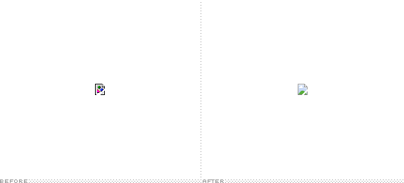
First used in 1994 with the beta release of Netscape, the "broken image" icon has become a staple of web browsing. In this Quora question, Netscape's original UI designer gives credit to Marsh Chamberlin of DataGlyph for creating the first, literally-iconic rendition of a shattered frame containing a sphere, pyramid, and cube. Since then, some browsers have used variations of the theme while others, like Safari, have gone with their own idea like a question mark for Apple's own browser. Until earlier this year, Google's Chrome browser had been using its own take on the original but one thing we know is that you can't contain Google to the status quo. A new broken image icon has started appearing across users' Chrome browser this year and since we've covered Google's favicon, not once but twice, I thought it would be relevant to cover this minor yet significant change.

The above is a broken image on purpose. Depending on what browser you are reading this in you will see Chrome's icon or you will be stuck with one from the competition.

Detailed view.
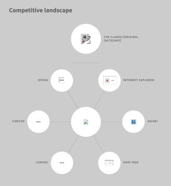
How other browsers render broken images: Safari and Explorer use graphic icons while others simply spit out dashes. And, of course, there is the granddaddy of all broken image icons, Netscape's.
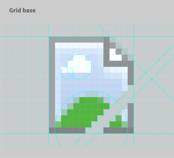
The icon is built on a strict pixel grid and forefront circular and diagonal planes.
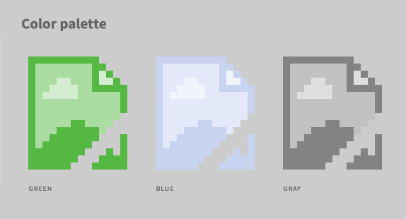
The icon has a limited, 3-color palette.
As much as I am used to not just Chrome's old broken image icon but the overall shattered-sphere-pyramid-cube approach I never found it particularly attractive. Effective? Sure. Something's broken and it ain't fixed. But in terms of elevating the genre of communication through iconography, most browsers have opted for the path of least resistance and have simply regurgitated the first idea that someone came up with 19 years ago. And as usual, Google is showing us the way to a better future where broken image icons are not some abstract-futurist-dadaist thingamajig but something that the larger population of the world will understand and appreciate the fact that something's missing: the uplifting image of a mountaintop with a striking blue sky behind and a lone white cloud floating accross it signal the loss of something meaningful, something universal, something… that is not there. No more. Chrome's new icon retains the equity of depicting a shattered image, maintaining a thread of continuity with the previous icon and with the broader language of image brokenness.
Google didn't stop at just making a more humane broken image icon, it's making sure that the icon is targeted, personalized, and highly localized as shown in the variations below.
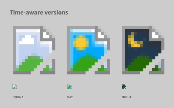
Not yet implemented, the icon will eventually change depending on each user's time zone and it will recognize whether it's day or night.
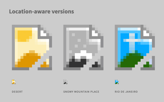
Since Google is already using your location every time you search in their Maps application, the icon will also be able to change depending on where you are.
Google's technical superiority on the web is unquestionable and its interest in other ventures like self-driving cars demonstrate that the company's ambitions extend beyond their ability to control online search and targeted advertising and the broken image icon is currently being developed as a proxy in real-world applications. Most of it is pie-in-the-sky thinking at the moment but lest you forget that not too far off people will have a browser/camera in their glasses, Google's experiments may arrive quicker than the jetpacks we've all been waiting for.

At Google X Lab, a team is working on embedding the icon's functionality into applications outside the browser. Like an image in a magazine that didn't make it to press.
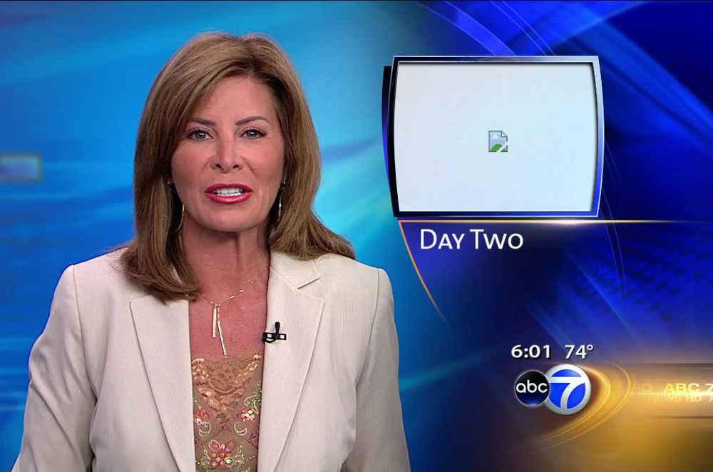
Or when the graphics team at local news channels do not load the proper image.

And, of course, it will also work on Google Glass.
As the last few images below attest, Google has also made sure that the new broken image icon is embraced by users to wear, customize, and, simply, have fun with it. Make it their own. This is especially meaningful as the presence of a broken image icon means that something has been taken away from the user, Google is giving back a little bit of the internet back to them by making the icon an image with global appeal for them to embrace. Overall, this is a fantastic evolution and we'll see if other browsers feel pressure to, as it were, mend their own broken image icons.
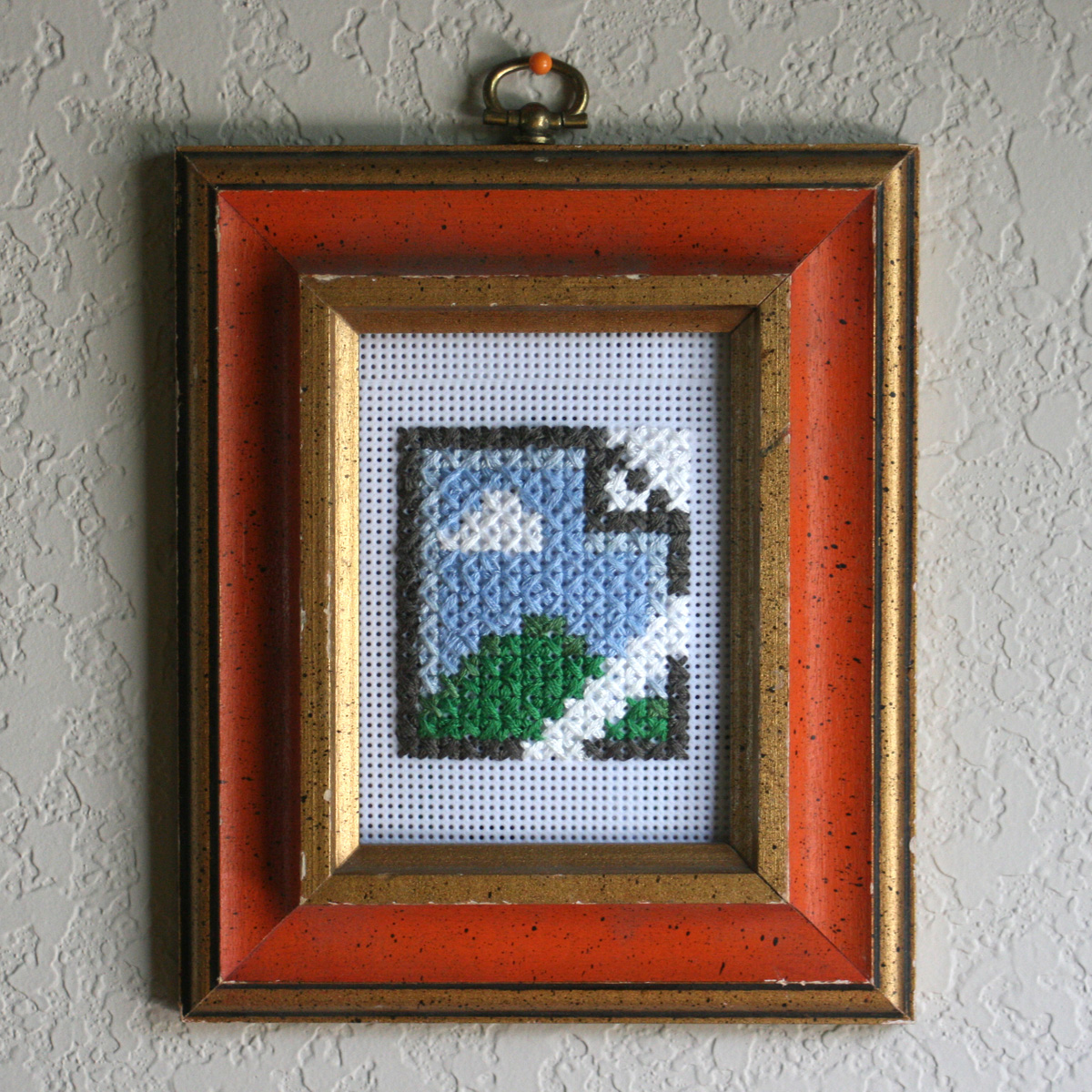
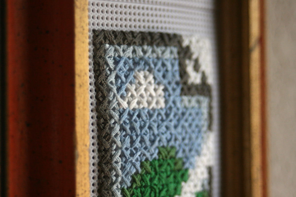
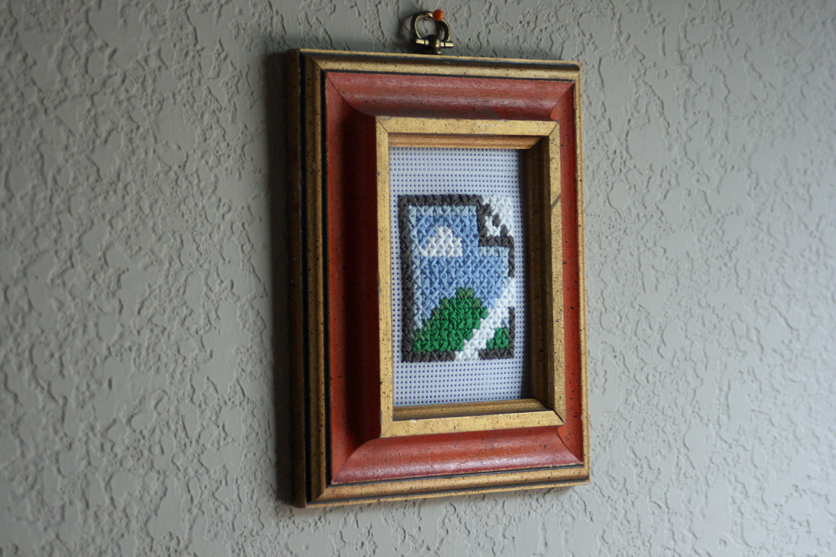
Understanding the importance of cross-generational and hobbyist appeal, the icon will appeal to grandmothers and DIY hipsters as is evidenced by this cross-stitch application.
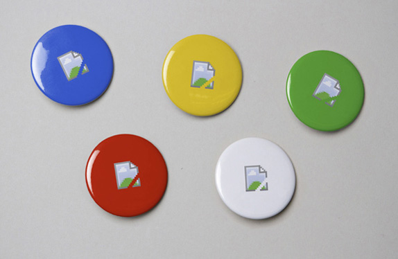
One can never underestimate the power of badges (or pins or buttons, no matter what you call them), below, to rally people.
To conclude, however, in a note of pessimism, I do have to wonder if Google's choice of image is nothing more than a jab at Microsoft and how they have overtaken them as one of the premier tech players. If so, well played Google. The message is loud and clear: All your image are belong to us.
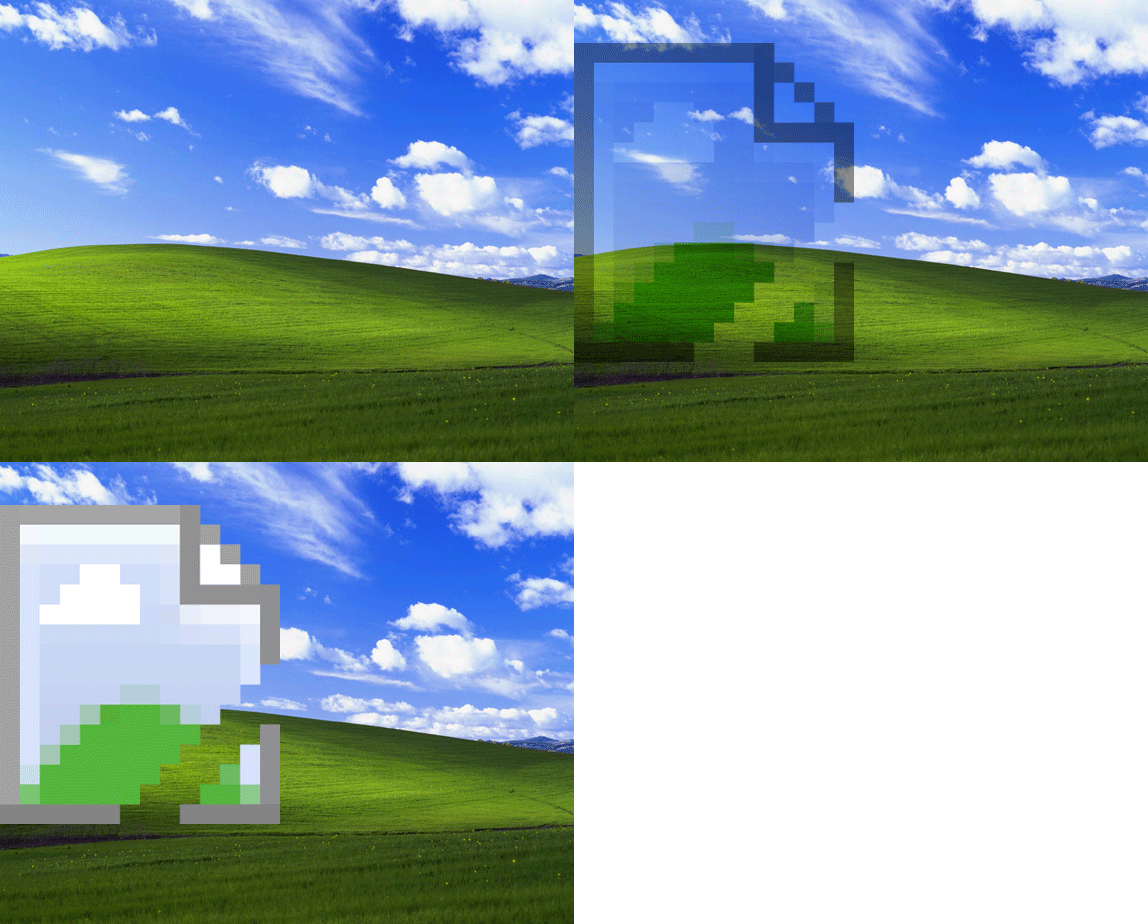
Is it just me or does the new icon resemble a little too much Window XP's ubiquitous "Bliss" wallpaper?

Don't forget to cast your vote about this post online
