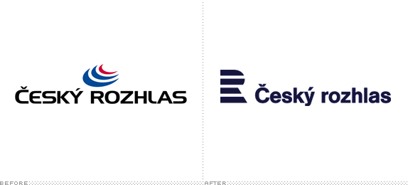
Established in 1923, Czech Radio (Český rozhlas) is the public radio broadcaster of the Czech Republic with four national stations — Czech Radio 1 - Radiozurnál (news, current affairs and music); Czech Radio 2 - Praha (entertainment and education); Czech Radio 3 - Vltava (cultural station); and Czech Radio 6 (analytics and current affairs) — as well as four specialized stations — Czech Radio Rádio Česko (news and current affairs), Czech Radio D-dur (classical music), Czech Radio Radio Wave (for young listeners), and Czech Radio Leonardo (popular educational service) — plus thirteen regional stations. In February Czech Radio introduced a new identity designed by Prague-based Marvil.
The new logotype is dominated by the large letter "R". "R" stands for radio, the Radio&zcirc;urnál station and also regional broadcasting. "The aim was to create a powerful logo that would become visually synonymous with Czech Radio. Formally minimalistic, the almost abstract design of the logo guarantees its universal applicability in all sizes and colour versions, at the same time providing it with a rather unique and easily remembered appearance," explains Pavel Zelenka. The symbolic form of the letter "R" is accompanied by an open typographic system describing the methodology of the creation of logotypes.
— Press Release


Brand introduction. At the 1:30 mark the video shows the logo system and applications.
The old logo, designed in 1995 and, according to the press release, winner of "Logo of the Year Award in 1997" was remarkably bad, with its clichéd radio waves sprouting from the top of 1970s phototypesetting typography that featured an uppercase "C" that was scaled about 101%. The new logo takes the idea of sound waves and mixing-board levels and applies it in a less obvious and more IBM-ish manner that lead to a considerably better mark that hints at the 1970s as much as the original typography but in a more positive way. The old-school mark is given a contemporary feel through peppy colors, nice animation, and an aggressive use by being blown up huge in ads. Overall, a major improvement over the old and even though it's not groundbreaking work it's a solid approach and execution.

CEO Peter Duhan at the press conference.

Blonde lady is not impressed.


Thanks to Valentin Delatte for the tip.

Don't forget to cast your vote about this post online
