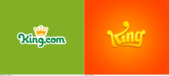
Established in 2003, King is one of the leaders in cross-platform, casual, social games with 150 exclusive titles available in 14 languages and has grown to become the second largest developer — behind powerhouse Zynga — of games on Facebook and a leader in mobile with over 108 million monthly players generating over 12 billion game plays per month. Interestingly, according to their advertising page, 75% of their players are women and 70% have children. King has offices in London, Stockholm, Barcelona, Bucharest, Hamburg, Malta, Malmo and San Francisco. Today, King introduced a new identity designed by London-based venturethree.

The new brand, based around the philosophy of 'Bitesize Brilliance' is designed to position King as the leader in cross-platform, snackable entertainment experiences. […] "We wanted to create an iconic visual identity for King that could sit alongside HBO and Pixar as a mark of the highest quality in entertainment. We designed a quirky new logo writing King in the shape of a crown - capable of working at 16 pixels square but at the same time scalable enough to make a big impact. Games like Candy Crush Saga are what people love about King, so we created a brand that compliments rather than dominates."
— venturethree project description

On-screen animations.
The previous logo didn't hold any surprises in its message or execution: a crown over the word King, punctuated by a 1990s ".com". A decent logo for sure, considering the gaudiness of online video game title logos. The new logo smartly drops the ".com" not only leading to a cleaner logo but strategically giving other gaming companies the finger in the most elegant way by proclaiming they are the king. No questions asked. The logo takes a minute to decode. At first it looks like any number of Dodgers-inspired script logos but then the crown comes into focus once you see the exaggerated (and, in any other logo, completely awkward) upper arm of the "K" and its terminal, centered in between two other exaggerated ball terminals in the "K" and "g", the latter swooping down and left to meet the stem of the "K" to get all Gestalt on the bottom of the crown. In less words: it's awesome. In application (see below) the logo is tilted and placed on top of people and characters, straddling the line between annoying and clever, but it mostly works. The logo is accompanied by a confetti of elements from King's games and the whole set-up is loose and fun. What this project lacks in gravitas it makes up for in candy-colored, no-worries vibes. Also in less words: perfect for the company and its audience.


Thanks also to Justin Glasson for the tip.

Don't forget to cast your vote about this post online
