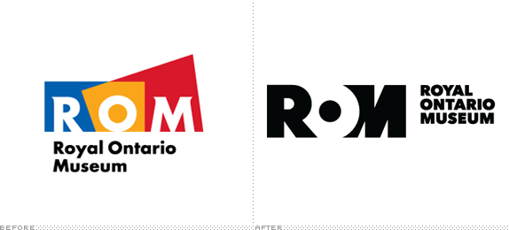
Opened in 1914, the Royal Ontario Museum (ROM), an agency of the Government of Ontario, is Canada's largest museum, with a dual focus on natural history and world cultures, attracting over one million visitors each year to its 30 galleries and six million objects in its collection. The museum is also well-known (and easily spotted) for its Daniel Libeskind-designed addition in 2007 that was part of an initiative dubbed "Renaissance ROM" for which the previous logo was designed. This week ROM introduced a new logo designed by New York, NY-based LaPlaca Cohen. (For a Government-owned museum, you know how much grief they must be getting for hiring Yanks.)
The "O" in the ROM is conceptualized as a lens, a portal to the ROM's collections, and to understanding the natural and cultural worlds. The new brand is adaptable through the addition of a wide variety of images from the Museum's natural history and world culture collections, as well as images from contemporary life.
— Press Release

"The logo symbolizes access and connection, and it also suggests flexibility," said Arthur Cohen, CEO, LaPlaca Cohen. "This isn't a logo for an authoritarian museum that presents a rigid experience, but an institution that is changing with the times, that is influenced by the communities to which it responds, and is alive and surprising."
— Press Release


The old logo wasn't bad and it clearly communicated the insertion of a pointy building into a more square building, aptly placing the three letters in between the overlaying shapes. But, clearly, the logo was too much about the physical space of the museum than the museum itself. The new logo isn't bad either. But it isn't amazing and it surely isn't innovative. The basic structure is a nice execution of the acronym with a little bit of negative space play, although I'm not sure why the "M" has an internal slant that makes it look like the "M" from another logo altogether. By itself, the logo would have been a moderate success but then they had to go in and apply the logo-as-window maneuver — or in this case, logo-as-portal — and that's where the logo starts to cheapen because the executions are mostly awkward and inconsistent with obvious image clipping occurring. It's probably not as terrible as I am making it sound and I'm sure the leaders at ROM are head over heels for it but for a museum with a fractal crystal stuck on its side, this logo plays it far too safe.
Thanks to Derek Jensen for first tip.

Don't forget to cast your vote about this post online
