Sticking with a theme early this week, today we are featuring another flexible and (not self- but still) generative identity. Although the company for which it is for does not meet the criteria for the kind of company that typically makes it unto Brand New, I'm always interested in showing approaches to identity that break out from those regularly featured here. Established in 2002, Fluidity is a Los Angeles, CA-based design consultancy that specializes in architectural and landscape integrations of water: fountains, pools, waterfalls, and more. A new, fluid — yeah, I know, I know, easy pun — identity has been designed by Chicago, IL-based thirst.

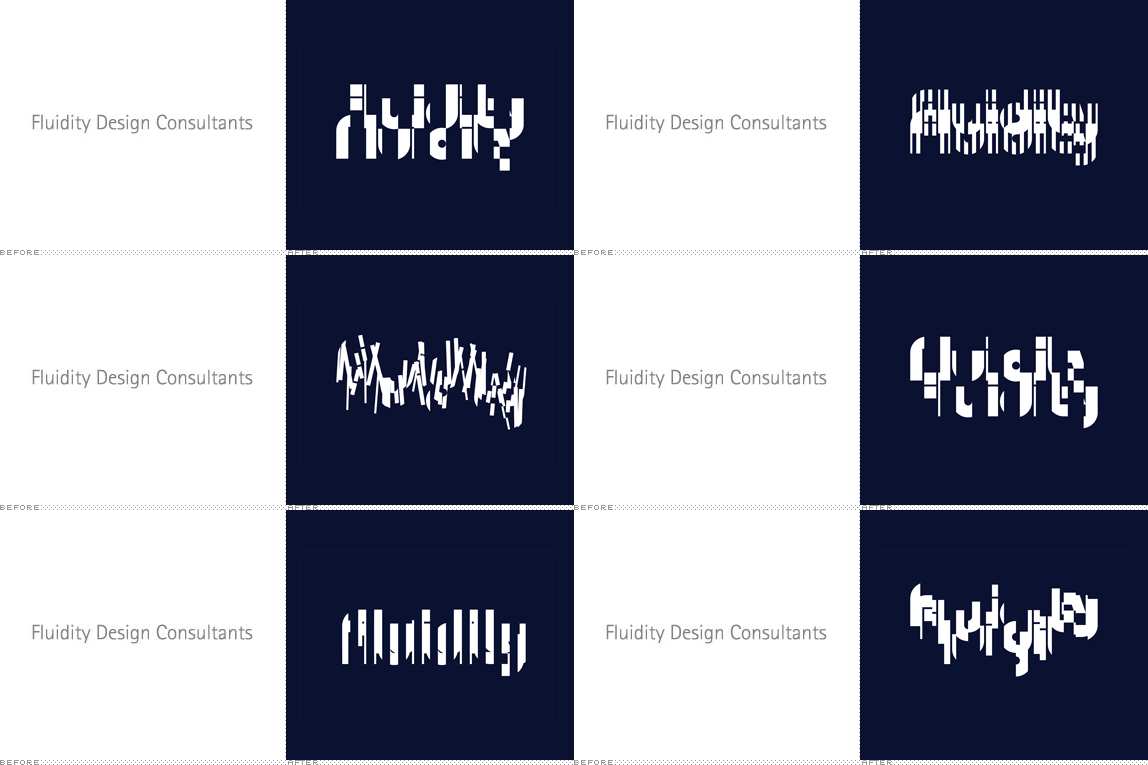
The constant change of water's visual form inspired us to design an identity that never appears the same twice. Ultimately, the identity is not one logomark but an infinite number of visual expressions inspired by refraction and behaving as one with the subject matter. Our design of Fluidity's identity typography questions the need for legibility while placing a higher value on recognition.
— thirst project page

Evolution of custom wordmark.

Final wordmark.

Selection refinement. "Visual forms that felt too stylized or too complex were rejected in favor of those that were more graphic, more bold."
Digital tool that allows for interactive generations of logo artwork, programmed in Processing.

All business cards are different.

"Digital stationery such as email signatures and Word templates contain code to generate unique logomarks for every document."
Logo introduction.
With a name like Fluidity perhaps the obvious solution would have been something softer or more curvaceous as opposed to the resulting identity which looks like planks of steel that have been cut with a very powerful deli slicer. This seems to place emphasis on Fluidity's engineering and design approaches more than an allusion to the medium they work in, so perhaps this identity helps establish it as a more serious, hardcore design firm. Conceptual and strategic approach aside, the resulting identity is both ugly and attractive. Many of the static logos are anything but attractive — depending on your definition of such word (in mine, they are not) — but as a whole and in a system, as is the case with 99% of flexible identities, the result works by generating its own mini, visual world.

Don't forget to cast your vote about this post online
