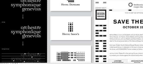
These Friday Likes are brought to you by the colors black and white.
Orchestre Symphonique Genevois
Although it's replacing a fabulous 1970s Avant Garde-tastic logo, this new identity by KW43 for Düsseldorf, Germany-based Orchestre Symphonique Genevois in Geneva, Switzerland, is like music to my eyes. Literally. Parts of certain letters have been replaced with the roundy parts of musical notes as if they were placed on a staff. The logo can then be "played", resulting in a quirky mnemonic sound. The resulting logo and typography are a little off-kilter and weird but the concept and application are great. Video above is in German but visuals are perfectly understandable [More].

Brøchner Hotels

I believe this is a student project. I'm almost certain. Nonetheless, one ready for primetime. Brøchner Hotels is a small collection of four boutique hotels in Copenhagen, Denmark, each apparently more charming than the next. By distilling their architecture down to their windows, local designer Mia Bjergegaard has created a lovely, abstract logo where the hotels can be used by themselves or grouped together, creating their own rhythm, not much different than the symphony identity above it. [More]

National Design Awards, 2004-2011

Things to consider upfront: this is not your typical Friday Like; it's not flashy; it's not generative or highly flexible; it's not one of those "Man, I wish I had done that" projects. In 2004, New York-based Tsang Seymour created the logo for the Smithsonian's Cooper-Hewitt National Design Museum National Design Awards which have risen in profile, popularity, and recognition in the past few years. That logo, in all its simplicity, has served as the basis to create wildly different materials each year that all strike just the right balance of Smithsonian seriousness and designer playfulness. It's a less than glamorous project that deserves its own kind of recognition. [More]

Don't forget to cast your vote about this post online
