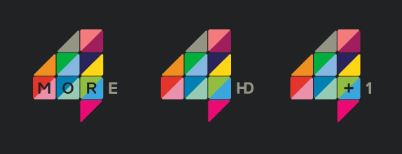
Launched in 2005 by British broadcaster Channel 4, More4 is a digital television channel popular for its range of documentaries, U.S. imports like The Daily Show, reruns from its parent company, and some original programming. Announced back in November and effective this week, More4 will start "focusing more fully on popular factual and features — life enhancing content, helping viewers to get the most out of their everyday lives." In other words, downers like "documentaries, arts and current affairs" are out and "programming which offers insight and inspiration to the way they live, including homes, property, food, health and fashion" is in. The new identity and on-air look has been designed by London-based ManvsMachine.
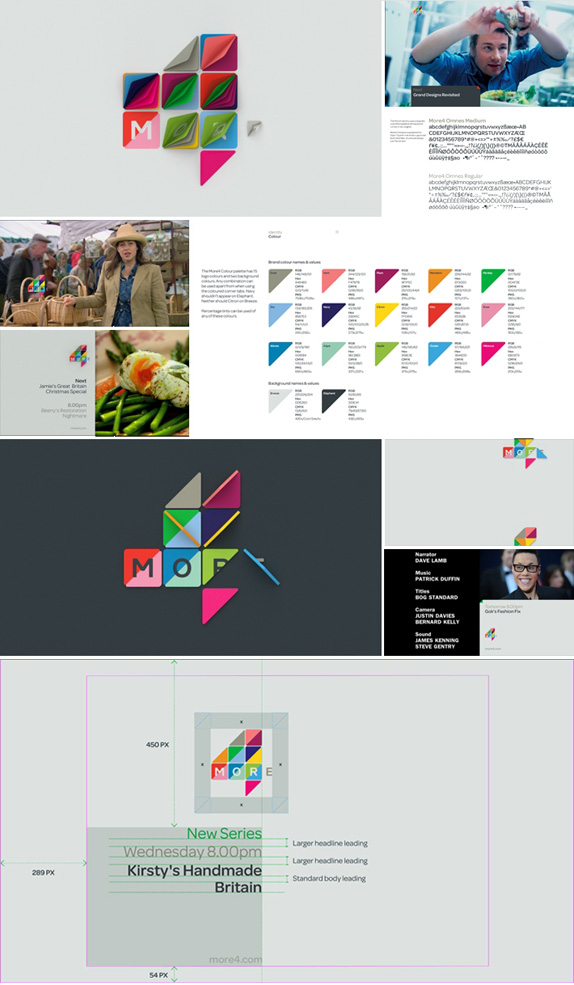
The re-brand is centred round a bold, flexible logo that morphs through a series of flips, folds and reveals. The colour palette reflects the vibrant nature of interiors, food culture, fashion and other contemporary lifestyle programming.
— ManvsMachine Case Study
The More4 re-brand is centred around a bold flexible logo, created from multiple triangles that flip, fold, attract and repel each other into position. The re-brand extends to a whole new on-screen look, that includes five truly stunning new idents.
— Channel 4 Press Release


The previous logo was a very nice and well liked execution by Spin that was perfectly in line with the more "abstract" branding of its parent channel. Amazingly, this new logo and identity manage to not necessarily improve but move to a kind of parallel graphic dimension where it is equally attractive and effective. At first glance the static logo looks too decorative and busy but once put into motion, the way it's supposed to be, the effect is quite fantastic.
Live-action idents see the brand break out into the real world in the form of mechanical 'flippers'. The installations inhabit environments from a domestic staircase to an abandoned fishing boat in Dungeness. To achieve this ManvsMachine teamed up with installation design pioneers, Jason Bruges Studio, to help design and build a flexible system consisting of over 400 individual flipper units.
— ManvsMachine Case Study
Live-action idents. NOT computer-generated. Check out the making-of at ManvsMachine's site.
On-air graphics.
My favorite part is how the flippers blend into the background (either white or dark gray) and make it seem as if it's embedded there like a space-age train schedule flipboard. The live-action flippers are also a great way of bringing the logo to life in a very unexpected way. Overall, More4 has gone from a moodier and more solemn vibe to something livelier and more colorful.

Don't forget to cast your vote about this post online
