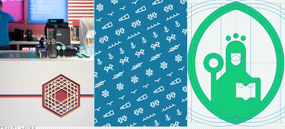
Today we play two truths and a lie: without reading the text can you guess which Like today isn't real/implemented? Regardless, all these share simple executions and bold lines. My favorite.
Bambu

With two locations in Finland, in Helsinki and Turku, Bambu is a medley of Asian cuisines into one single menu. Taking a cue from the different Asian cultures Helsinki-based Bond latched on to the hexagon as a repeating motif among them and then built a lovely icon that looks as sticks of bamboo laid on top of one another. The hexagon then drives most of the materials, from the hard-angled teardrop shape of the menu to the business cards to the tables themselves. The upbeat color palette also helps distance it from similar logos like the Dharma Initiative's. [More].

Cape Horn

Cape Horn is a yacht-services provider along the entire coast of South-East Asia: if you buy or own a boat they will help you take care of it. Moscow-based Sergey Tarasenko has created a fun system of icons and patterns punctuated by what looks like a very grumpy, eagle-nosed, long-bearded sailor. You know if somebody tries to mess with your boat this Popeye-esque figure will beat the crap out of that person and not lose the placement of his little hat. I also like that his face looks like a half moon and his hat like a little boat. Or that the whole icon looks like an anchor. [More]

Universidade de Coimbra, Alta e Sofia

It's a shame that this is only a proposal and not a real identity for the application of University of Coimbra to be part of the UNESCO World Heritage. Porto-based Miguel Palmeiro arrived at an amazing simplification of the university's seal that is bold, contemporary, and, simply gorgeous. The minty teal color gives it an extra freshness in the realm of higher institutions. [More]

Don't forget to cast your vote about this post online
