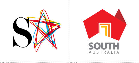
Smack in the middle and covering the south area of Australia, South Australia is one of the sixteen states and territories of the country, accounting for a small 8% of its population, most of them living in the capital city of Adelaide. Unlike its way more popular neighbors New South Wales and Victoria and their own capital cities, Sydney and Melbourne respectively, we don't hear much about South Australia. Hoping to change that, the Economic Development Board under the leadership of Jay Weatherill, Premier of South Australia, has just introduced a new identity for the state designed by Cato Partners. Without getting further into the work, and judging from the image above alone, you know that this is not going to end well and the backlash has already started, driven mostly by a Facebook page simply called The new South Australia logo sucks.

Our new brandmark clearly demonstrates we are the central doorway to the whole of the country. South Australia is the south of Australia. The pivotal state. The hub. The only one that touches every other mainland state. If you were overseas and knew nothing about this country, suddenly our State seems like the natural entry point and the best place to go first. Our doorway welcomes opportunity. Everyone plays a part in greeting opportunities at every level. Including the people that simply live here and enjoy a world-class lifestyle.
— Brand Book (PDF)

Logo superimposed on map showing the state of South Australia.
This is so much more than a logo. What we have devised is a completely new master brand for South Australia. Essentially it's a complete design system which includes a brandmark, a colour palette, typeface, a graphic design system to unite our identity. It's an idea that can be expressed in any number of ways. The border device, for example, instantly brands any image it frames. More than that, it welcomes you into the picture. So, if you want your brand to wear its South Australian credentials loudly and proudly, you couldn't do better than to use this subtle device.
— Ibid

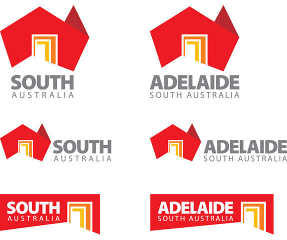
Lock-ups with the main icon, and alternate door-only logos.

Boom! There it is: Logo as door as window.
Designers are amazing. They can take all of that information and turn it into something as simple as a doorway. The doorway that is South Australia. (Can you ever see it in the same way again?) With multiple doors all opening up our State. Welcoming tourists, migrants, investors, traders and businesses. Inviting discovery. Accessing our secrets. Offering a refuge, communication, friendship and hospitality. (That's very South Australian.)
— Ibid
Brand launch video. Lots of pretty moving images at first. Logo animation at the 2:24 mark.
Sound and light show in Elder Park — one of the weirdest and most random brand related sound and light shows ever.
The previous logo was a rather fetching depiction of the state's acronym, SA, with the "A" rendered as an overlapped star. "From here on in," though, as the brand book suggests, "we're South Australia, not SA. Our name is another great asset. As SA, we could be South Africa, Saudi Arabia or South America to an international audience." So the SA acronym died and gave way to a depiction of Australia's contour with one of the worst renderings of a door metaphor in, like, ever. Which is a shame, really. The origami-inspired shape of Australia is rather nice — even though references to origami are only evident in the videos above and done quite lamely — and could have led to an interesting diagonal-line-heavy texture in the logo that delineated the South Australia state. Instead, the elegant shape is ruined by some sort of triple-framed door that starts to look like when you have two facing, parallel mirrors and all elements repeat ad infinitum. Except there is none of that sense of fun or wonder in this logo. Not even when the icon is used as a window, which is usually a fail-safe technique to save mediocre logos.
The icon is then paired with some horribly uninspired, default-looking sans serif that comes in two flavors: Bold and super tight for "SOUTH" and light and extra spaced-out for "AUSTRALIA". Neither execution works on its own and together they bring out the worst in each other. There is also an alternate version of just the door element that crops into a rectangle. This is even worse. And it's used until the kangaroos come home at the bottom of every promotional image or artifact.
Overall, this is an extremely under-developed identity that was good in concept but failed to reach any kind of potential.


They even managed to make the lapel pin concept image look bad.
Our brandmark is destined to become an icon. An icon that could lead you into trade shows or exhibitions through a series of doorways, each reflecting a different industry. A different region. A different seductive image. And virtually any image can be cropped into our brandmark. So we can make South Australia into whatever we want to make it. Creative. Innovative. Industrious. Yes, we are.
— Ibid


Um, no thanks.
Thanks to Samuel Jeyaseelan for first tip.

Don't forget to cast your vote about this post online
