Known to all Danes simply as DR, the Danish Broadcasting Corporation is the official English name for Denmark's public broadcaster. Founded in 1925 to operate the radio monopoly, it extended into television in 1951 when it launched Denmark's first — and, for many decades, the only — TV network. Today it operates six national TV networks, ten national radio networks, eleven regional stations and a series of related services. This year DR is making major changes to its schedules and overhauling some of its TV channels and in January it revealed a refined logo as part of a new identity system designed mostly done in-house, spearheaded by Anders Thulin, DR's design editor, who, along with typographer Elias Stenalt Werner created the new corporate logo, while custom typography for service logos was created with Copenhagen-based Kontrapunkt. In-house agency DR Design drew up guidelines and applied the new identity system for various media.

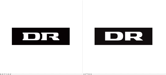
New logo.

>Past corporate logos: 1964, 1996, 2005, 2007.

An overlay of all past logos.
DR's characteristic logo with its two extended letters was first introduced in the 1960s. It has gone through two evolutionary redesigns since then, the last iteration in 2005, which contained several fine ornamental details that caused some technical difficulties. It lost legibility when scaled down to small sizes and was hard to read against messy backgrounds. The latter problem was remedied after a few years by creating an alternative logo where the two letters were placed in a spacious black rectangle. This didn't solve all problems and created new ones. For example it meant that the company had two versions of its logo in circulation. Overall, DR's visual identity was a patchwork of different elements developed at different times without a holistic approach. After a complete review of DR's communication, it was decided that the new logo would be an evolutionary continuation of its predecessors.


New logo installed at headquarters.

While previous DR logos have been red, that color was definitely dropped from the logo with this redesign. The color still has sentimental value for those employed by the company, which is why it is retained as an accent color, as seen on the car livery above.
The team decided to simplify the letters as much as possible to make them scalable while also maintaining continuity with previous logos. Research showed that as long as the thick vertical strokes and thin horizontal strokes where maintained, people would still recognize the logo as that of DR even if all other decorations were removed. The result is more neutral and seemingly less typographically interesting. But it is more legible and better achieves its primary purpose: identifying the company.

Past logos for television channel DR1: 1996, 2002, 2005, 2009.
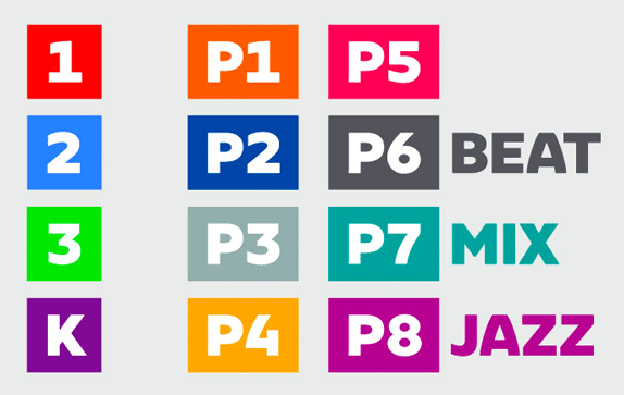
DR wants its corporate brand to be present in all its communication, which is why its various services and channels are all identified with some amended version of the corporate logo. Much like the corporate logo, the service logos have developed over time, often without coordination. This is the first time the corporation has made a complete overhaul with a uniform logo system for all its TV networks and radio stations. With the exception of the brands that target children, all TV networks and radio stations are now identified with their name in a colored square or rectangle attached to the DR logo. Custom numbers and letters for four of the TV networks and eight of the radio stations were developed by Kontrapunkt, who aimed to design something simple and functional.


Channel and station identifiers.
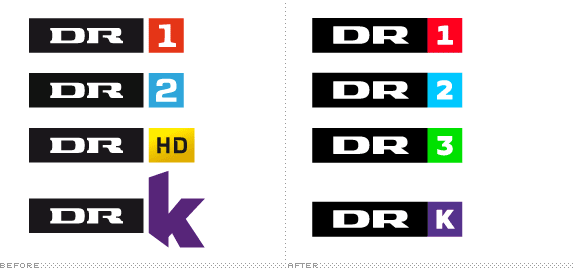
Both the corporate logo and the custom typography were designed for this identity system. This means all letters can have the same height, creating a more harmonious impression compared to the previous system with its variety of font sizes. Until some years ago, DR only had two TV channels — DR1 and DR2 — that had a uniform design with a tiny numeral in a colored square attached to the DR logo. It then launched four new thematic channels in a short timeframe and all used logos that went in wildly different directions.
This redesign straightens this all up and creates a clearer brand hierarchy. The four channels that target adults have uniform designs based on the tried and true model of squares attached to a black rectangle. Visually, this raises the youth channel DR3 and the cultural channel DR K to a level more equal to the two older networks.

At the moment, DR has one channel for kids called DR Ramasjang, named after a the Danish word for "hullabaloo". In March, another channel will be launched for kids between the ages of seven 7 and 12 called DR Ultra. Ramasjang will then be refocused to preschoolers. You can't communicate with children as you do with adults, and the kids channel are the only ones that have been allowed to break templates used for the other logos. They are also the only logos designed in-house at DR Design.

The radio stations have gone from one set of template-based logos to another. The new template is cleaner and completely in line with the TV channels.

[Ed.'s Note: in conclusion… boring but highly efficient.]
Simon Wennberg is a graphic designer and writer from Lund, Sweden.

Don't forget to cast your vote about this post online
