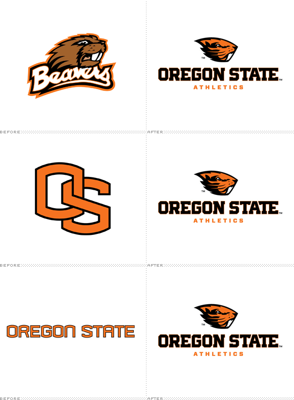
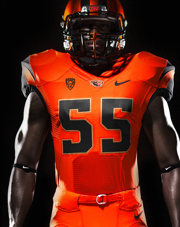
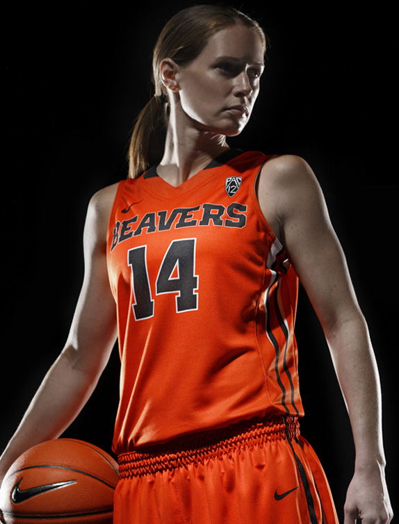
Playing in the NCAA's Division I tier through the Pac-12 Conference — sorry non-Americans, I know that means absolutely nothing to you (not that I blame you and in the bigger picture it doesn't really matter other than you should know that's the higher echelon of college sports) — the Oregon State Beavers are the sports team of Oregon State University. They haven't been overly successful in terms of winning — only three NCAA national championships in Wrestling, Cross Country, and Baseball — but they have big followings in their football and basketball programs. Yesterday, the Beavers introduced a new logo, identity system, and uniforms designed by Nike's Graphic Identity Group. The new beaver and block typography will replace the old beaver (obviously) as well as the well-known "OS" monogram and typography (all shown in animated GIF form above).
The beaver logo is concise and iconic, with no extraneous elements. The mark is strong, innovative and tenacious, accurately reflecting the spirit of Oregon State University Athletics and expressing our position with purpose and conviction. The shape of the logo is deliberate and fast, capitalizing on the unique shape of the animal's head. Careful consideration was given to the unique elements of the beaver, such as its powerful, iconic teeth, and its smoothly swept back fur coat.
— OSU Athletics Reveal Page
The Beavers script was designed as a nod to the heritage of Oregon State Athletics. Inspired by the fluid stroke of handwriting, the script is a modern rendition of a classic look. The varied width of the lettering creates movement in the script, drawing the viewer's eye through the mark.
— Ibid

The wordmarks are bold graphic treatments that create a clear, consistent and visually memorable identity. The Oregon State and Beavers wordmarks capture the essence of the Athletics brand. The wordmarks work closely in support of the primary identity, and a traditional collegiate lettering style inspires these unique letterforms. These elements create a powerful, exclusive look that distinguishes the wordmarks from other institutions.
— Ibid
Custom display typepface and numeral set (Beaver Bold): To assist in creating a consistent look for a wide variety of athletic communications, a custom display typeface and numeral set has been designed as an enhancement to the overall identity. Strong block typography is an essential component of the Oregon State Athletics heritage. It speaks to the no-nonsense, hard-working nature of student-athletes, coaches and fans. It is honest, stable and imposing.
— Ibid
This is a textbook case of athletics identity. All the accoutrements of the genre are perfectly in play. (1) Floating, angry mascot head? Check. (2) Blocky collegiate-style slab serif? Check. (3) Alternate script lettering? Check. (4) Pumped-up video reveals? Check. (Sorry, can't embed those). While I'm being halfway sarcastic, the truth is that, within the realm of college sports identities, this is actually pretty good. The drawing of the beaver is pretty convincing, effective, and nicely contained as well as a major positive contrast to the old beaver, which looked a little coked out. The custom block typography attempts to bring some freshness to the category with some subtle details like the shape of the "G" or the "TE" ligature in "STATE". And the uniforms are surprisingly restrained and elegant — especially against crazy shit like this by Adidas. Overall, this is a very nice update.




Don't forget to cast your vote about this post online
