Originally built as the stables and riding house of the Prince of Wales in 1803, the Brighton Dome in Brighton, England — dubbed "city on the edge" — is one of the premier performance venues in the UK, hosting "over 600 events spanning music, theatre, dance, comedy, literature, spoken word, visual arts, film, digital and more." Brighton Dome consists of three separate spaces: The main Concert Hall, the Corn Exchange, and the Studio Theatre. The Dome and its venues, along with multiple others, and the city of Brighton have been host, since 1967, to the Brighton Festival, a "three week celebration of music, theatre, dance, circus, art and film." These two entities have been given a new, cohesive identity by London-based johnsonbanks, who explain that the Dome "has always struggled to clearly identify itself, even to the local arts community" and that "each of its constituent parts and multiple venues tended to act independently of each other across 11 months of yearly programming," while the Festival has undergone an identity redesign each year.


Sample "before" applications. NOT by johnsonbanks.
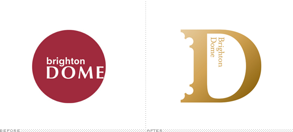
We began with the Dome itself, and took its extraordinary architecture as our starting point. From the entrances to the main building, and the concert hall's ceiling itself, extravagant Regency era 'scallopped' shapes are a major feature. At first sight, the 'D' for the Dome is a simple seriffed design, then you realise that the architect's (William Porden, 1804-8) careful curves are echoed in the outside serifs.
— johnsonbanks Project Update

Architectural detail of the "scalloping."


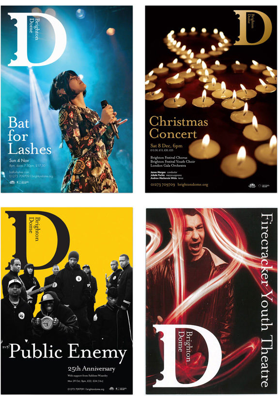
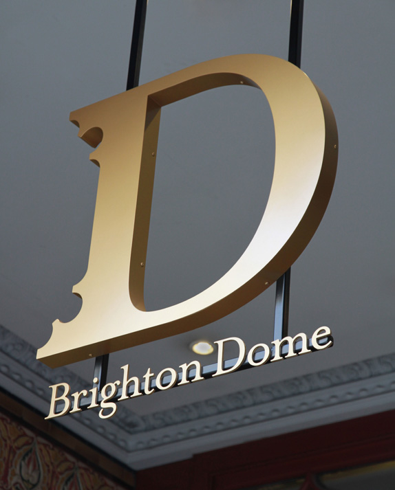
There is a lot to take in visually in this post, so I'll keep things short and sweet. The new Brighton Dome logo sets the tone for both its identity and that of the Festival's. Pulling in the architectural details into the serif of the "D" forces it to have to be rendered really big so that they don't get lost and in turn creates a wonderful "stamp" to put on everything, making all the posters and brochures evidently cohesive, even when there is a picture of Public Enemy behind it one day and a jeans-clad composer the next. The sideways typography, set in vintage 1990s Mrs Eaves, is at first disconcerting but once in application, over and over, it makes the name stand out and not get lost amidst the imagery and the overpowering "D". The black, white, and gold color palette works great IRL applications, where the "D" gains natural shading, which has then been forcefully retrofitted as a gradient in the digital logo — always a challenge when spec'ing those fancy metallics.

Unified signage across the different venues.


[The] serifs of the bold, almost brutal letterform symbolise different aspects: the steps up to the stage, the idea of a festival in a 'city on the edge', whilst retaining links back to the 'D's curves.
— johnsonbanks Project Update

Elements infused into the logo.


Different colors and slab serif edging.

The previous Festival logos have all been typographic and leaning towards the weirdo. Nothing wrong with that, just, well, not all have been necessarily pleasant. Taking a cue from the big "D", the Festival employs a big "F" whose big bold slab serifs can be bitten into with different motifs like steps, triangles, and the "D"'s own scalloping. The results vary in efficacy and pleasantness. The simpler, the better. Within the "F" we have another vintage font, Lubalin Graph, set sideways. I'm not completely a fan but I guess it works, mostly by complementing the "F" in the same way that Mrs Eaves complements the "D".

This year's visual motif johnsonbanks has "taken guest director Michael Rosen's hands and eyes to create a homage to one of his favourite periods, the Bauhaus (specifically Herbert Bayer's The Lonely Metropolitan)."

Overall, this is a great unifying system from a challenging project and as johnsonbanks notes, these two big, bold letters will hopefully "take on a life of their own".

Don't forget to cast your vote about this post online
