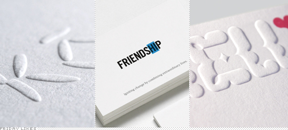
Some really thoughtful ideas today along with strong executions from Paris via London, Australia, and South Africa.
Miss Kō

For Miss Kō, a concept-driven, Asian fusion restaurant in Paris, London-based GBH has created an amazingly simple logo using the shapes of nine grains of rice to spell out the name. The non-perfect placement of the grains is what gives the idea an extra push into something original and organic. There is a whole other aspect about a naked lady — an avatar for the fictitious Miss Kō — with a full body tattoo that I don't care much for. (Mind you, I don't mind the naked lady part, but that whole aspect of the identity is too Vogue-fashion-spread for me.) Link somewhat NSFW. [More].

Igniting Change

Described as "a purposely tiny charity sparking ideas, alliances and resources for social change," Igniting Change finds a positive message in almost any cause: Hero in Heroin, Over in Poverty, Elder in Elderly. The identity, designed by Sydney-based RE:, is remarkably simple, using the idea of a blue highlight marker to bring attention to what matters. [More]

Jelli

At first glance this might look gaudy and tacky but the visual strategy that extends from the logo all the way to in-store decorations and furniture by Johannesburg, South Africa-based Ateljee is quite fantastic and appropriate for children boutique, Jelli. Based on a heavy-handed geometric grid the identity extracts its logo, an alphabet, characters, and complex illustrations for murals, all in a consistent aesthetic. It's a perfect fit for the audience. [More]

Don't forget to cast your vote about this post online
