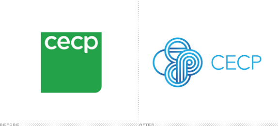
Established in 1999 by a group of power players, chief among them actor Paul Newman, the Committee Encouraging Corporate Philanthropy (CECP) brings together senior executives from the world's leading companies to steer them towards meaningful, high-quality philanthropy. To date, CECP includes "more than 180 CEO members, representing 150 major corporations and over $10 billion in annual corporate giving." This list alone, of CEO members, is probably worth more in pixels than what's in your bank account right now. CECP recently introduced a new identity designed by Futurebrand.

Wanting its visual expression to better reflect [a] sense of interconnectedness — and the positive impact that's possible when ideas and resources are shared — CECP partnered with FutureBrand to create a new logo and visual system. Replacing a linear wordmark, the logo reinforces the concept of disparate voices and knowledge building upon itself and coming together as one. The "c" letterform is composed of a single curved line, parallel shapes form a lowercase "e" that then cascade into a three-ringed "c" which completes in a four-ringed "p."
— Provided text


Fairly boring message video, but good logo animation at the 4:35 mark.
The previous logo, also designed by Futurebrand, could have used the help of some logo philanthropy of its own at the time — wildly boring, visually and conceptually. The new logo fixes both misgivings with a smartly thought out logo that instantly communicates connection and collaboration through a lovely monogram that builds, one line at a time, on the acronym. I really, really wish Futurebrand had refrained from adding the gradients to the icon as they are not needed at all; see how good it looks white on blue on the brochure cover above. The wordmark feels a little like an afterthought and the lighter blue color makes it recede into the background in contrast with the bolder icon. It also feels redundant with the icon, as both elements are spelling out the same thing. Perhaps in a year or two the icon can stand on its own without the name once its built some equity among its audience. In application the logos gets a little crazy, serving as a window like in the brochure, or a multiple window like in the business cards and poster. I'm not convinced this logo was meant for such uses, but it pulls it off somewhat convincingly. Overall, a vast improvement over the old with a sophisticated-looking logo to lead the way for all these CEO folk.

Don't forget to cast your vote about this post online
