Way back in May of last year we reported on the new logo for Hispanic channel Telemundo, a division of NBCUniversal. Designed by New York, NY-based loyalkaspar the logo received middling reviews, mostly being "fine". This January, Telemundo finally made an official introduction of the logo and new branding and on-air package — the latter designed by London-based DixonBaxi— with a splashy takeover of Times Square. (See photos of that here, on the sidebar.)


"The Power of T" celebrates the impact and influence of our brand as well as a unique and reflexive relationship with our viewers. We are the one they come home to, the one they take with them, the one they talk and text about. […] Welcome to a brand new Telemundo brand. Bright, bold and brimming with life. Just like the audience we serve.
— Telemundo Media


The logo remains "fine" with these clearer images and extended look at how it is applied. It's nothing too exciting but nothing too offensive either, despite complete reliance on shading and overlay. The overlapping shapes of the logo do gain some intention when an image is placed inside the right-hand shape (see directly above) and (see and read directly below) the "T" serves as a sentence-starter. As usual, in application the logo exceeds expectations.
The new brand identity includes an on-air network tagline system at the heart of the channel's new tone of voice that creates a seamless connection between Telemundo's programming and its viewers. The letter T (pronounced "Te" in Spanish) serves as a double entendre connecting both T, the brand, and "Te," the viewer, through multiple on-air applications, such as:
- T informa: Telemundo informs you.
- T conecta: Telemundo connects you.
- T emociona: Telemundo moves you.
- T inspira: Telemundo inspires you.

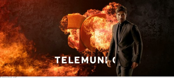
In its first rebranding effort in over a decade, Telemundo Media affirms its position as an industry innovator and seeks to become the leading media brand for the modern U.S. Hispanic audience. The new look extends from fresh, vibrant expressions of the brand for daytime to a deeper and explosive look for dramatic programming at night. Bold talent images and innovative graphics come together to deliver a fresh, updated look to the screen in cinematic customized promos that reflect the network's various genres and shows. Music themes for the brand image spots are performed by up-and-coming Sony Music singer Pedro Capó.
— Press Release

New on-air look montage.
The new on-air look is, literally, explosive capturing the fiery, passionate, bombastic attitude sometimes associated with Hispanic programming (i.e., telenovelas, futbol, etc.). The effects are a little all over the place (i.e., fire! color bombs! more fire!) but they are all fun and visually exciting. The on-air package, advertising, and overall identity rely on my "favorite" typeface of the moment, Museo. I don't have to spell it out again. But I will: I-T S-U-C-K-S. Fine, it w-o-r-k-s, but I don't have to like it.
Overall, this is really a spot-on approach and execution and it looks really good.
Behind the scenes at the making of the on-air look. Great look at how the effects are made.
Complete package first spotted at The Branding Source. Many images pulled from there.

Don't forget to cast your vote about this post online
