Today we have a little diversion but one that I think has a lot of potential to demonstrate the need for logos to have a secondary (more like alternate) version for use in smaller screens and applications. Students at Oded Ezer's Typography for Interaction Design class at H.I.T (Holon Institute of Technology), Visual Communication Dep., in Israel have been given the following brief: "Re-design a screen compatible version for a known print-based logo.(as App launcher icon, logo for splash screen, favicon, etc.) Define and keep in mind the core values of the brand, and the technical requirements for the adjustment to screen." It's important to understand that this is NOT a redesign exercise but a translation of logos to maintain their essence and perform better at small sizes with less elements and fuzziness. Also remember this is student work, not final deliverables for a client so constructive feedback is encouraged. Biggest polling system on Brand New available at the bottom.
(See also: Oded's class' efforts on translating Latin alphabet logos to Hebrew and Arabic).
Brand: Quaker / Student: Erica Rotberg
Core values of the brand: Reliability / Stability
Steps taken:
Redrawing figure to suit screen demands and creating a more modern and fresh look.
Improving readability by separating the logotype from the drawing and by enlarging inner letter spaces.
Application Icon design, which encapsulates the logo by using one letter of the brand name and by using same color palette and division.


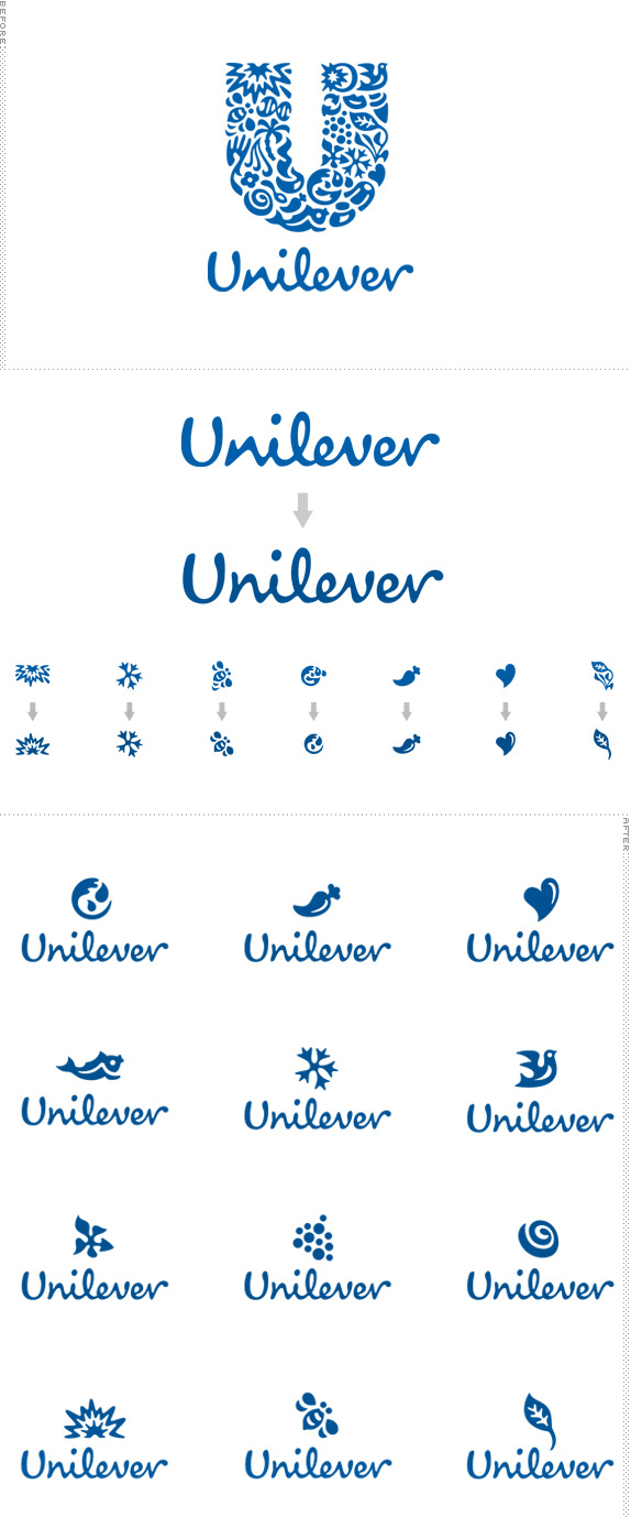
Brand: Unilever / Student: Ma'ayan Kara-Oz
Core values of the brand: Vitality / Versatile / Friendly
Steps taken:
Improving readability by correction of letterforms, enlarging inner letter spaces and adjusting coloring.
Creating full set of icons that derived from the original logo and used as a part of an animated new logo - Unilever logotype remains static while the icons are replacing alternating.


Brand: Osem / Student: Elad Nayder
Core values of the brand: Of the people / Authoritative.
Steps taken:
Improving readability by correction of letterforms.
Strengthening the core values of this classic Israeli brand by a more selective use of color, by making the frame shape simpler and by redrawing a less slanted letterforms.
Application icon design, which encapsulates the logo using formal elements and the new brand colors.


Brand: Al Mayadeen / Student: Ortal Yahud
Core values of the brand: Dynamic / Authoritative / Updated
Steps taken:
Creating a new, minimalistic logo by joining the modern logotype with the calligraphic arabesque.
Adjusting coloring.
Creating an App icon and web Favicon based on the newly created graphic element.


Brand: Energizer / Student: Anat Kenig
Core values of the brand: Reliability / Dynamism
Steps taken:
Strengthening the core values of the brand by a dynamic and modern way.
making a new alternative dynamic shape using more selective use of color.
Improving readability and look and fill by correction of letterforms, enlarging inner letter spaces and And tilt general shape.
Creating an Application Icon and splash screen which encapsulates the logo using the new logo elements and brand colors.


Brand: Ikea / Student: Ilya Katz
Core values of the brand: Accessible / Reliable / Global
Steps taken:
Creating a new form for the logo adjusted for screen demands. the new form suits to the brand identity but gives a sense of modern and simple.
Improving the readability of the logo type and colors.
Creating an App icon and web Favicon from the new formal.


Don't forget to cast your vote about this post online
