Established in 1989 in Oklahoma City, OK, as City Arts Center, the recently renamed Oklahoma Contemporary is a nonprofit organization that offers progressive and innovative art exhibits and "encourages artistic expression in all its forms through education and exhibitions." Last week the organization announced its name change and introduced the new identity designed by Saffron.
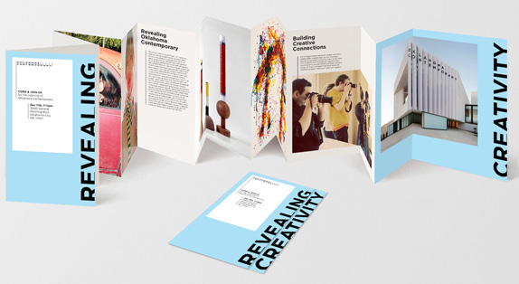
The Oklahoma Contemporary Arts Center brand is focused around the idea of 'Creative Connections', speaking to the role of Oklahoma Contemporary in connecting the local community with contemporary art, connecting art with the individual, and hosting the conventional alongside the unfamiliar. This spirit of connection is reflected in the new visual identity that allows for the work of exhibited artists to take center stage, while projecting Oklahoma Contemporary's unique personality. The identity will be brought to life across Oklahoma Contemporary's communications and their built environment, including a new stunning building due for completion in 2016.
— Press Release


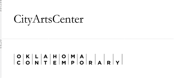
The old logo wasn't particularly good or bad, boring for sure, but nothing too offensive. It simply stated what it was: the arts center of the city. That's probably what local folks said, "let's go to City Arts Center". Now locals, who are already in Oklahoma, have to say "Let's go to Oklahoma Contemporary." Awkward. Perhaps the hope is that they'll say "Let's go to the Contemporary" or "Have you see the show at the Contemporary?". The name change feels perfectly well reasoned to elevate the name of the organization to a national level so that "Oklahoma" is recognized but the resulting name is really, really long. (How long before they rebrand as "OC"?). The logo is also pretty long. I don't mind long logos, they are just a pain in the ass to work with but Saffron has found a nice way of implementing this evenly-spaced and ruled 20-character Gotham wordmark: In application the first line of the logo extends to part of the content, so the logo doesn't get completely lost as it gets smaller in usage due to its length. The logo, its various options with images thrown in and cropped, and the oversize cropped typography all feel like clichés of contemporary art organizations, things we've already seen. It's not entirely original but it definitely works, it looks good, and, branding-wise, helps place Oklahoma Contemporary in the same playing field as other sans-serifed contemporary art organizations.


Don't forget to cast your vote about this post online
