Simplicity is the theme of today's likes.
Augusta Ventures

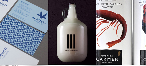
Nothing too fancy, snazzy, or sassy here. Just a good, old fashioned, smart monogram by Moving Brands for Augusta Ventures, a "litigation-funding venture that supports those unable to bear the cost of legal fees." At first glance it may look like an abstract icon, but it's obviously two "A"s mirrored without their outside legs forming a "V" in the middle. But where it really got me was in the monogram's diagonal alignment with the name underneath, where the "A"s in "AUGUSTA" also have their outer legs chopped off and match the angle of the monogram. Just lovely attention to detail. [More].

Doméstico

Described as a modern mexican saloon but "without Mexican hats, moustaches or mariachis" by its Monterrey, Mexico-based designers, Manifiesto Futura, Doméstico will make you feel manly enough with their Big Gulp-sized bottles of pulque. The sophisticated and minimalist black and white with hints of copper extends from the stationery to bottle labels. Mexican hats or mariachis are definitely not appropriate with such color palette but perhaps the Tijuana Zebra is? [More]

Querida Carmen

I'm a sucker for packaging with pretty illustrations and this set of soup cans from Spanish producer Querida Carmen designed by Barcelona-based Grafica with illustrations by Lis Beltran look as tasty as the idea of paella right about now. The big, colorful illustrations are nicely offset by the postage-stamp-like logo and simple typography. [More]

Don't forget to cast your vote about this post online
