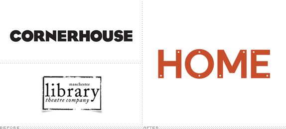
In April of 2012 it was announced that two Manchester cultural institutions — Cornerhouse, an "international centre for contemporary visual arts and independent film" and the Library Theatre Company, who produce a mixture of contemporary drama and modern classic plays — would merge to create a single, producing arts organization. Now, this new organization has a name, HOME, and new identity designed by o street and Creative Concern.
Following extensive research through audience & stakeholder engagement workshops, we developed a brand personality in 'The Play of Ideas' and a new name, 'HOME' that is both challenging and welcoming.
We have developed a dynamic type marque, extensive brand guidelines and a bespoke typeface: a kit-of-parts that will allow HOME to establish itself as a global arts brand. These visuals illustrate the potential of the identity and will be used to inform the applications across environmental, digital and printed collateral.
— Provided text


The logo and typography is a nod to the industrial past of the location (old factories with uppercase titling) and also to the cinema sign which the Cornerhouse is known for (shown). Image: Reena Mahtani.

The logo with different letters knocked out and the notches they leave behind.


Page 1 of letterhead in various color options, and page 2 on the lower right.
The new logo, on its own and in its full state (with all the letters), isn't much to behold. Just a simple uppercase sans serif with holes punched through it, like an instructional step in an IKEA manual. But when letters go missing in application, the identity develops an edge and builds potential for being memorable by, well, not being there. The idea, as it comes across, is that HOME is always changing, never set or complete, a kit of moving parts with room for interpretation and completion by the public. It may take months if not years before the absence of letters and presence of miniature dots become recognizable brand elements for HOME but on launch they present an intriguing aesthetic that should get the organization some attention.

Business and thank you cards.


Outdoor advertising.


Stuff.

Don't forget to cast your vote about this post online
