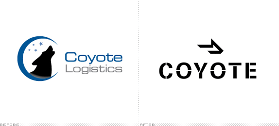
Established in 2006, Coyote Logistics is a third party logistics and transportation, meaning that they accommodate shipments with a variety of carriers, finding trucks that have available space in trips they are already making. According to Inc. magazine, which listed Coyote as the No. 1 company in Logistics and Transportation, it has had a 13,846.8% three-year growth. Coyote counts with over 300 employees and an aggressive (in a friendly way) attitude. This past Fall they introduced a new identity designed by Moving Brands.
Moving Brands created a new logo for Coyote which expresses their brand story — "Powerful Momentum". The logo is called 'The Arrowhead'. It builds on the strong name by abstracting the Coyote's silhouette whilst encapsulating a strong left to right motion.
The spare, direct feel of the logo is emphasized further by the stencilled wordmark.
— Moving Brands Case Study
Identity creation video.
The old logo had all the makings of a start-up logo: literal interpretation, gradients, and bad typography (unless Eurostile is your thing). The new logo hits and misses at the same time. I really like the extreme abstraction and that it moves into an old-school train/freight aesthetic with the aggressive angles and unapologetic arrow but if it weren't for the name I would never have guessed it's meant to be a coyote. The name is Coyote, so my point is almost moot, but I think it would have been a little more relevant if they had pulled back two or three levels of abstraction. The wordmark is a tad clunky; the selected sans serif looks almost like a default font, the stenciling is too shy to really matter, and the weight is just slightly less heavy than the mark creating a noticeable difference but not enough to be evident. Nonetheless, the new identity and overall tone of voice is a vast improvement over the old one.


Thanks to Najwat Rehman for the tip.

Don't forget to cast your vote about this post online
