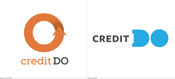
Launched in 2010, Credit Do is a non-profit organization that aims to give youngsters a good grasp of what it takes to be financially responsible and independent while at the same time doing social good. Participants enroll in a project like, say, a food drive and they earn credit towards purchasing food, clothes, supplies, etc. from the local supermarket involved and then for every credit they earn ($10 an hour) another company will match that amount and place it in the participant's saving account. A cycle of goodwill and small amounts of money earned! All the while, Credit Do provides simple lessons on finances. This month, they launched their first comprehensive website and new identity by New York, NY-based Mucca.

Credit Do is a non-profit that provides people of all ages with credit towards food, clothes, and other essential goods in exchange for doing social good. For such a radically simple idea, Credit Do needed a radically simple way of expressing it. We were tasked with developing the voice and visual identity for the brand, beginning with a completely reinvented website. […] Our focus on simplicity informed every touchpoint between the brand and its audiences, from fundraising forms and stationery to the new CreditDo.org. Designed with the look & feel of a long-scrolling infographic, the site illustrates the program's impact in a fun and relatable way that moves people to action.

Letterhead.

Business cards.
![]()
A few of the icons created. Dig their girth!
Usually, the "before" logos of non-profits are quite bad and sad-looking. Not this one. A competent slab serif with a giant, recycle-y circle; a nice, bitmap shadow; and a gritty texture that indicated a grassroots approach. The new logo, despite being nicely constructed and laid out, doesn't really say anything. The problem lies in that the name of the organization is awkward. Credit do what? "Credit" is a fine word and "Do" is a fine word but together and in that order, they simply sound like financially-challenged Tarzan-speak. Point being: Mucca is placing the emphasis on the right element, bolding "DO" and building the whole verbal and visual language around it, but the starting point is strange and the logo on its own can't explain much. The identity is colorful, friendly, and youthful, perfect for the demographic. And the tone of voice is just right, making this identity more about what it says than how it looks saying it. As usual, Mucca finds a way to add enough quirk to make it more than just type on color blocks, with the choice of Joshua Darden's Freight Sans Black that has enough personality of its own to have a perfect credit history.


Brand messaging.

Don't forget to cast your vote about this post online
