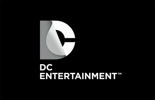
Earlier this week DC Entertainment revealed a new brand identity.
Some of you remarked about this on the LDL Facebook page, so for those who aren’t Facebookers, here are a few images showing Landor‘s redesign (also reported on Brand New, with a ton of comments).

“DC Entertainment, a Warner Bros. Entertainment company and home to iconic brands DC Comics, Vertigo and MAD, revealed today a new brand identity. The new identity is reflective of the company’s mission to fully realize the value of a rich portfolio of brands, stories and characters, distinguished by incredible breadth and depth across publishing, media and merchandise. A new logo for DC Comics was also introduced, closely aligning with DC Entertainment’s new mark.”

“The design of the new DC Entertainment identity uses a “peel” effect – the D is strategically placed over the C with the upper right-hand portion of the D peeling back to unveil the hidden C – symbolizing the duality of the iconic characters that are present within DC Entertainment’s portfolio.”

More info and images on the DC Comics blog.
The initials “DC” came from the company’s popular series Detective Comics, leaving the title suffering from RAS syndrome. As Daniel Gray pointed out, it should be Detective Comics, or DC, but DC Comics just looks stupid.
You might be interested in this 2005 post by Khoi Vinh on when Milton Glaser’s DC logo was ditched.

Designs by Milton Glaser, 1976 (left) & Brainchild Studios, 2005 (right)
Thanks to Paul Stretch and Derek Graham for the tip.
