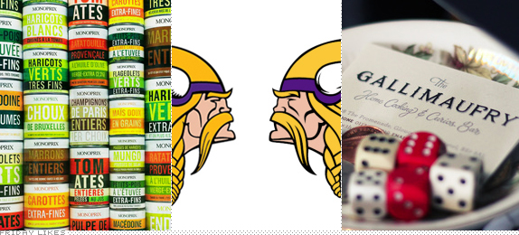
A norseman gets sandwiched between two food-related Likes on this Friday.
Monoprix

I don't know how I missed this two-almost-three years ago when it first launched but c'est la vie sometimes. Designed by Havas City as the house brand for Monoprix, a major retail chain in France that sells pretty much everything: food, hardware, clothing, gifts, etc.. Driven by an Andy Warhol aesthetic, the packaging does away with food photos and only uses big, condensed sans serif typography on colorful bold blocks that take up the whole product. Amazing how hot everything looks. There is no single repository online with enough images or a strong case study so I leave you with a "more" link to the Google Image Search result for "Monoprix packaging". [More].

Minnesota Vikings

Ever since the Minnesota Vikings joined the NFL in 1961 they have been represented by "The Norseman" logo, which has gone relatively unchanged — someone had to digitize blondie at some point — in 50 years. Yesterday, the Vikings announced with enough fanfare that they had given their logo a fine-tuning and detailed exactly what they had done, from cleaning up the horns and matching them to those decal'd on the team's helmets, to braiding his hair a little better. This isn't earth shattering but I just love the restraint and the understanding that they have one of the most recognized NFL logos. Plus, those braids are totes adorbs. [More]

The Gallimaufry
The Gallimaufry in Bristol's Gloucester Road opened last year with a lovely piece of lettering by London-based Ged Palmer. And, yeah, that's it, really. What else can you say? It's lovely. And it's even lovelier sign-painted across the awning with the help of sign painter James Cooper. Plenty more images at the link. [More]

Don't forget to cast your vote about this post online
