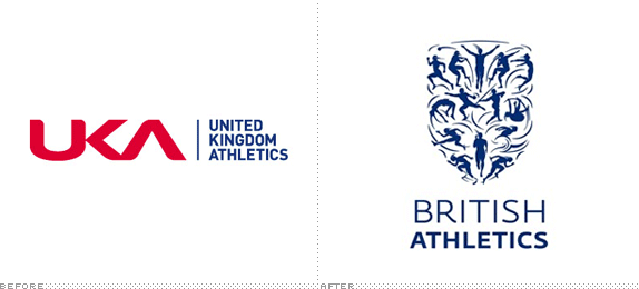
Established in 1999, UK Athletics (UKA) "oversees the development and management of the nation's favourite Olympic and Paralympic sport, from grassroots right through to podium." With the attention gained during the London Summer Olympic Games, UKA decided to launch a new brand, British Athletics, that sort of replaces the UK Athletics name and brand, except it does not. For confusion purposes, "British Athletics will be used in all external communications," while UK Athletics will be "reflecting the governance and NGB duties of the organisation." This article explains much better what that means. The new British Athletics logo was introduced earlier this year.
Update: The identity has been created by London-based SomeOne. More images and quotes have been added to this post.
In terms of organization and branding strategy, this may be a little confusing at first. Okay, a whole lot of confusing. But take, say, Pepsi as an example: PepsiCo is the parent brand and it owns the Pepsi, Gatorade, and Tropicana brands. The parallel here is that UKA is PepsiCo, and UKA then "owns" British Athletics as well as its other home country federations: England Athletics, Athletics Northern Ireland, Scottish Athletics, and Welsh Athletics. UKA has simply chosen to be known by the more consumer friendly — if Northern-Ireland-excluding name — "British Athletics". It's as if PepsiCo suddenly changed its name to GatoradeCo, playing favorite to that brand. Not ideal, but it would be a response to the market, which is what seems to be happening here. Anyway, on to the logo.
The new British Athletics logo is made up of 14 different "pictograms" each representing a different discipline within the sport and as Sophia Warner, British Athletics Commercial Director explains, the unique design has been created to reflect the diverse nature of athletics.
— Press Release
![]()
Icon detail.

Type detail.
"We are British Athletics" video.
The new logo has its good and bad moments. When seem small it looks pretty great, with a rich, swirly texture and a symmetric-yet-asymmetric structure that plays really well. Upon closer inspection, the human shapes are a little awkward at times, like the pole vaulter and heavy-ball-thing thrower, just something too cartoonish about them. Since the individual athletes can be picked out and used for the specific event, this could be a concern but more often than not people will see this logo small. It's great that they have included paralympic sports with the wheelchair racer and the prosthetic-leg sprinter at the bottom. The typography is pretty decent and, thank the Thames, it's not Gill Sans. Overall, it's a more consumer-friendly logo than UKA and it speaks quite figuratively to what the organization does.
The branding device of the badge is designed to work at both small sizes where the illustration makes a crest-like shape -- and at large sizes where each of the sporting figures can be more clearly read. The leading symbol is detailed, but is designed to retain primary elements even at small sizes and in challenging applications such as stitched shirts and digital branded environments.
Individually these pictograms can be picked out in colour for each specific discipline, or even used as patterns themselves -- increasing pride and relevance to all of the types of athletics, as well as building a broader brand world for all communications and events.
— SomeOne Case Study


Thanks to Jonathan Bean for the tip.

Don't forget to cast your vote about this post online
