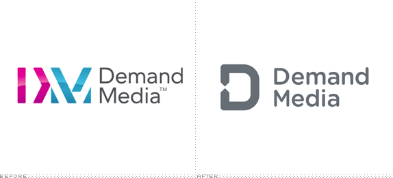
Established in 2006, Demand Media is a "leading digital media company that informs and entertains one of the Internet's largest audiences, helps advertisers find innovative ways to engage with their customers and enables publishers to expand their online presence." They manage the immensely popular sites eHow and Cracked as well as livestrong.com and indieclick.com, among other smaller sites and services. This month Demand Media introduced a new identity designed by San Francisco, CA-based Manual.
Our new brand identity is all about demonstrating how Demand Media is a touchpoint in people's real lives.
We connect people to content that's relevant to them.
We connect businesses to the web.
We connect brands with people and people with brands.
This is what our branding is all about--connecting, serving as a touchpoint, and meeting people where they are.
— Brand Guidelines


The old logo was interesting, despite its poor shading and Flickr-esque color palette, communicating connections and intersections. The new logo is a simplified version of that idea with a simple "D" monogram that has a more evident graphic device for connection. Not the most exciting thing in the world but a solid premise executed without fuss. The wordmark is set in Gotham Round and pairs well with the icon, softening the otherwise imposing "D". Where the identity becomes more interesting is in application, when the connection part of the monogram gets blown up and serves as a framing device for copy.
An important part of our graphic look and feel are the use of arrowheads. The arrows are derived from our logo, and signify connection and action.
Used alongside our bold color palette and angled headline typography, the arrows provide a bold and engaging graphic look and feel to all our communications.
— Brand Guidelines


The images above are taken from their brand guidelines (PDF) so there is a lot of Lorem Ipsum — don't let that distract you. The approach is simple and effective, providing a colorful system to deliver content. It might grow repetitive after a while but for now it gives them a fresh toolset. Lastly, there is a bunch of icons, shown below. Overall, a very appropriate internet-y identity that doesn't feel too cute or too friendly or, well, too internet-y.
![]()


Thanks to Brian Dillon for the tip.

Don't forget to cast your vote about this post online
