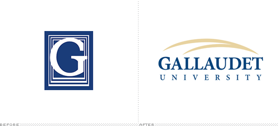
Founded in 1864, Gallaudet University in Washington, DC is "the world's only university in which all programs and services are specifically designed to accommodate deaf and hard of hearing students." Gallaudet is a bilingual university, offering all of its courses in both English and American Sign Language to close to 1,800 students with more than 900 employees, of which almost half are deaf or hard of hearing. This week Gallaudet introduced a new logo, designed by an internal design committee with two Gallaudet alumni, Zhou Fang and Scott Carollo, credited as the designers. The process of the redesign has been thoroughly documented here.
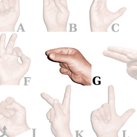
The symbolic design of the logo represents the university's bilingual mission by portraying "Gallaudet University" in American Sign Language (ASL) as well as in English, the two languages contained in the mission. The ASL component is demonstrated by the two arches meeting at a point. The design represents the movement of the sign for "Gallaudet" which is the letter "g" formed with the forefinger and thumb making an arch across the brow and meeting near the temple.
— Press Release


American Sign Language, letter G.

"Stylized" letter G in sign language specific to Gallaudet University.
This is probably one of the best logos of the year in concept but also one of the worst in execution. Starting with the two open points of the sign language letter G and swooshing it both visually and with the motion of the hands is pretty brilliant as a way to create a unique identifier for the university, no much different or unifying than, say, the Hook 'em Horns hand signal of UT. Unfortunately the execution is bland and antiquated with some terribly uninspired typeset serif and a double-swoosh that, even though grounded in a great concept, looks like a hundred other swoosh logos. Substance tends to trump style, but bad style can ruin the best substance.
Thanks to James I. Bowie for the tip.

Don't forget to cast your vote about this post online
