Founded in 1977 in New York City, The Vitamin Shoppe has grown to be one of the largest purveyors of nutritional supplements in North America with over 500 stores and 20,000 unique SKUs. According to their website, The Vitamin Shoppe is the "first and only choice of people seeking to fulfill their health and wellness needs."

Before and after: The Vitamin Shoppe storefront.
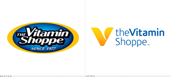
Ye olde Vitamin Shoppe logo featured a gilded holding shape and several other heritage cues such as the old-timey spelling for 'shoppe' and the prominent established by date. The new logo, while keeping the blue and gold color palette and somewhat cumbersome name, is revitalized by an iconic V symbol and a modern, rational type system. The new conversational logo text works well on one line, two lines, centered and left-aligned. Even the TM is thoughtfully placed as a period in each of the versatile lockups. The simple curves of the V are reminiscent of the previous holding shape without taking things too far. It's a simple mark that shines everywhere from wide-open storefronts to cramped applications like social media.

The new Vitamin Shoppe logos come in all shapes and sizes — the gold V sits very nicely on blue.

Capital letters are forbidden in the new store interiors.

Sporty water bottles sporting the new V.
It's also the presence of white that makes the new system seem fresh. Unfortunately, the more you see their new Dax-like typeface, with its tortured lowercase a, the worse it begins to look. It doesn't help that the type is often set too large, conspicuously lowercase and accompanied by cloying faux handwriting. The collateral layouts could benefit from the care and simplicity put into the logo itself.

The rest of the visual system features bright colors, silhouetted photography and close crops of the V on white

The V in social media.

None of the packaging on the The Vitamin Shoppe's 20,000+ SKUs has been updated.
And the last piece to this puzzle is the product. Understandably, TVS is taking their time with their packaging. Making alterations to a system this large is a huge capital expenditure and it's conceivable they wanted to see how the new brand was received before affecting how their labels are designed and produced. Still, it's arguably their most important brand touchpoint and it's a big disconnect when you walk into a new Vitamin Shoppe. Hopefully the packaging is in for a redesign that lives up to the store.
Thanks to Brandon Horoho for first tip all the way back in August, 2012.

Don't forget to cast your vote about this post online
