The following post is a guest contribution by Matt Rudd of Rudd Studio.

I wanted the ITV logo to get off the fence and stand for something. Alongside the informative BBC and the provocative Channel 4, ITV is friendly and warm. It brings about shared emotional experiences. I felt that the logo should be based on handwriting, and that the letters might be lower case and joined up.

In the drawings below I was thinking about the flowing rhythm along the bottom of the letterforms. The little stroke flowing into the first letter enhanced this sense of flow, but it tended to make the whole unit feel less like a logo. I explored different levels of ‘life’ and energy within the marque.

First digital drawing of the logo.

I wondered whether the use of symbols within the V might work across the sub-brands.


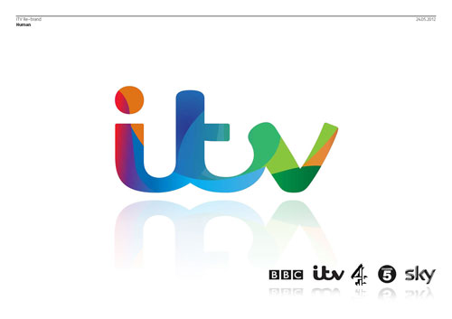
Below is the first look at the new marque alongside other broadcasters’ logos. I felt that it was distinctive and legible, but the heart symbol was too much. The typography alone had enough warmth in it.

At this point, I started to work with my old friends at Fontsmith. It was great getting into the detail. As well as considering weight and proportion, we wanted to formalise the marque so that it had authority and gravitas, whilst retaining its human DNA.

Since we dropped the idea of slotting a heart shape into the logo, we no longer had to make the V symmetrical. We all began to favour drawings of the logo without the stroke leading into the first letter.

We played with logo treatments to see how it might work across the different sub-brands.


From the beginning of the project, Rufus Radcliffe (Group Director of Marketing and Research at ITV) and I talked about the idea that the main channel would have many colours whilst the other, more specialist channels would have a single colours. Multiple colours would speak of the varied content on the main channel. In the first place, we looked at using the silhouette of the new logo as a window on an animating world of swirling colour.

This way of achieving multiple colours felt weak. I always loved Martin Lambie-Nairn’s multicoloured Channel 4 logo, and with this in mind we looked at ways of dividing the logo into distinct sections which could each have its own solid colour. The divisions are based on the flow of the handwriting on which the marque is based. To begin with, we considered having six versions of the multicoloured logo for use on and off air.

One of the six colourways.

One of the six logo colourways on a poster. The idea was that the designer would choose the most appropriate colourway for the subject.

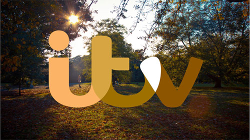
Our brief was to create a brand which proudly held the network’s content. Also, to show ITV as a positive part of many people’s lives in the UK. I did not feel that these connections were strong enough with the range of six colourways. I suggested that we embrace colour wholeheartedly, with the five parts of the logo drawing colour from their environment.

We felt that this was the final piece of the puzzle. We saw this colour-responsive behaviour as a great device in static and moving situations. The mechanism became known as ‘colour-picking’.

My intention was always to make a logo that could be big without being shouty. The colour picking device helped us even further to assert the brand in a way that was confident but not annoying. The logo could was no longer a badge, it was an intriguing and enjoyable addition to still or moving images.

The final job with the logo was to pick a hero set of colours for use where there is no imagery. The upbeat and modern colours are picked from across the colour spectrum to suggest the network’s wide range of content.

—
You can view more images from the channel rebrand on the Rudd Studio website.
Related, from the archives: More4 rebrand options.
