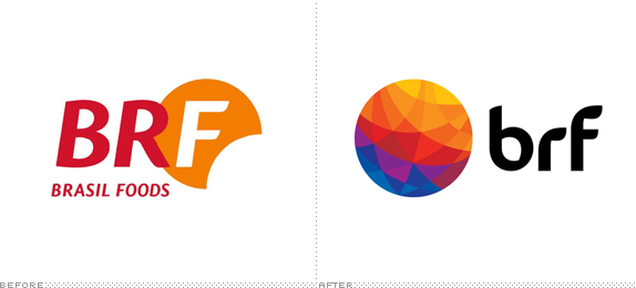
No big projects to start off the week, so we'll turn to Brazil to get Monday started and perhaps continue with a few simple, logo-only reviews this week. Established in 2009 with the merger of Perdigão (est. 1934) and Sadia (est. 1944), BRF (originally BRF Brasil Foods) is one of the world's largest food companies managing some of the most popular consumer product brands in Brazil like the previously eponymous Perdigao and Sadia, and Batavo, Elege, and Qualy. BRF operates over 50 production facilities and distribution centers and employs more than 115,000 people. This past January they introduced a new identity designed by Interbrand and A10, the latter responsible for BRF's previous identity.
The BRF logo has been created to represent our essence. The adopted symbol represents the globe with all its cultural, social, territorial and racial diversity. The new brand strategy expresses our positioning and objective of cultivating bonds, bringing lives closer together, thus incorporating elements which are the essence of BRF: Has Energy; Is a protagonist; Cultivates bonds; Dialog with the world.
— Press Release

The old logo was fine although I'm not sure what the holding shape for the "F" was meant to be: an eclipse about to happen? A rising sun with some kind of metaphor for business? Or, simply, a cookie with a bite taken out of it? I like the latter. Now, call me crazy, but I really like the new logo. There is something very appealing about the texture created inside the circle. It's totally generic and gratuitous but it has pretty colors, fractal-ey shapes, and is interestingly asymmetric. Even the "brf" wordmark with its weird construction has some redeeming qualities (two of which are not that counterspace in the "b" — yikes — or the pure black choice). I would love to see some applications of this, as I think there is great potential in that texture. Overall, a nice, edgy improvement over the old logo.
Thanks to Yuri M Emygdio for the tip.

Don't forget to cast your vote about this post online
