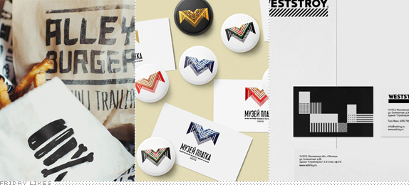
A burger, a shawl, and a construction company walk into a bar. They end up on Friday Likes. (Man, I need to work on my Friday Like intros a little harder).
Alley Burger & Chili Trailer

In the alley behind his own existing restaurant, JUJU, in Seattle, Marcus Charles decided to open a food cart aptly named Alley Burger & Chili Trailer and for its identity, Seattle-based Corianton Hale went medieval on it by sprinkling it with "weapons you might encounter in an alley fight" that go perfectly well with the black marker aesthetic. For the right burger I'd be willing to pick up some nunchucks and fight for it. [More].

Shawl Museum

I'm 99.99% sure this is a concept only, but that's never stopped me from liking something. For a museum (that does actually exist) in the Russian town of Pavlovsky Posad focusing on the history of the shawl, Moscow-based Vova Lifanov created this beautiful geometric logo of a shawl that also makes the letter "M" and can take on a number of shawl-y textures. Proving that making the logo bigger isn't always a bad thing, the logo and texture look great when blown-up across a shopping bag, brochure, or coffee mug. [More]

Weststroy

From another Moscow-based designer, Denis Bashev, comes this gridalicious identity for a Russian construction company, Weststroy, that specializes in two-floor buildings. The typography is super clean and the geometric patterns are a great addition as both an underline to the wordmark and as abstract building blocks for the materials. The choice of blueprint-blue nails the construction concept. [More]

Don't forget to cast your vote about this post online
