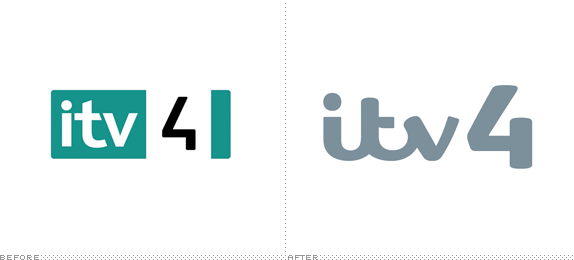
Last November we reported on the redesign of ITV, the biggest commercial television network in the UK. At the time, only the logo for the main channel had been introduced. Now, the full scope of the project — that includes revised logos, idents (over 80 produced), and on-screen graphics and navigation for all four channels — has launched. The project was carried out internally at "a dedicated 'pop-up' design studio" led by incoming Creative Director Phil Lind and Head of Operations Claire Finn. In this post we have insights from the team based on a very comprehensive case study they generously provided. My only comments on this one: This is an amazingly intense amount of work and it's expertly carried out.
Introduction to the new identity.
The key creative concept was to position ITV as 'the heart of popular culture': neither fringe, like Channel 4, nor highbrow, like the BBC, but a channel that is right in the fabric of people's lives.


Group Marketing Head Rufus Radcliffe appointed the broadcast identity specialist Matt Rudd of Rudd Studio to lead an in-house and freelance creative team to develop the new logo and the new brand world.
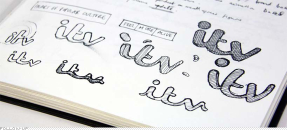
The design team spent ten weeks exclusively drawing up and reviewing logos, with all marques posted on the walls of the temporary pop-up studio at post-production company Envy. 'That isn't much time to come up with a totally new marque for a big organisation like ITV,' says Rudd, whose other brand work includes Channel 4. 'But we fought for the logo to be given sufficient attention, and I like to think even in this short time-frame we've elevated the brand into something very proud and confident.'

'The logo had the right feeling, but it was when I thought about it changing colour with its environment that I got really excited about it. The logotype is divided into five segments: each of which 'picks' a different colour from any photographic or video image the logo runs with. This means that whether on promo endboards, idents, press, posters or digital formats the ITV brand is literally drawing from ITV's content. In on-air output the marque's legibility subtly ebbs and flows as it animates with the live action. This design innovation became known as 'colour picking'.

'Key to the success of this rebrand,' adds Lind, 'was to create a brand that people could really associate with. I chose a very strongly identifiable and affordable house style on all our idents by restricting ourselves to using traditional in camera techniques across all the channels, incorporating beautifully composed framing, single-shot takes and predominantly live action. This in itself would help the ITV channels to start feeling very much like a family.

Both idents and OSP benefitted from the ground-breaking use of the colour-picking logo. Freelance Creative Director Gavin Leisfield developed Rudd's logo by designing a colour-picking algorithm that automatically picks colours from the footage.
A sample of the new ITV idents. See them all here by clicking through the arrows at the top of the YouTube player.
The first batch of 80 idents took two months to make, with the creative department drawing up not scripts but A2 boards with very brief descriptions of subject matters, places, people they aimed to capture and travelling up and down the UK to shoot vignettes of ordinary members of the British public's lives. By showing very beautifully observed moments of real life, they seek to underscore the channel's very human and approachable nature, 'Trying,' as Snape explained, 'to pick the things people would have an emotional response to.'

ITV2's idents were created to show the ITV2 side of life. Not only as the home of infectious entertainment but also a haven for the young and young at heart.
Sample of new ITV2 idents. See more here.

Re-casting the channel as the TV equivalent of a carefully curated collection of well-thumbed and loved books and collections.
Sample of new ITV3 idents. See more here.

We set out to lasso all that disparate programming by defining ourselves as a channel for men, but in opposition to the general pressure on men to transform, to improve. ITV4 is non-judgemental: it's a place for men to be free and be themselves.'
Making of the new ITV4 idents.

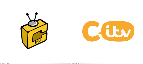
CITV is the channel by kids for kids. Many of the idents which feature 'C' monsters are actually animations made by viewers themselves. […] Some idents are official, CITV-generated idents, [while for others] children have the chance to draw their own ideas for the logo, which in-house team will then animate, called 'C-Creatures'.
Sample of new CITV idents. See more here.

And there you have it folks.


Don't forget to cast your vote about this post online
