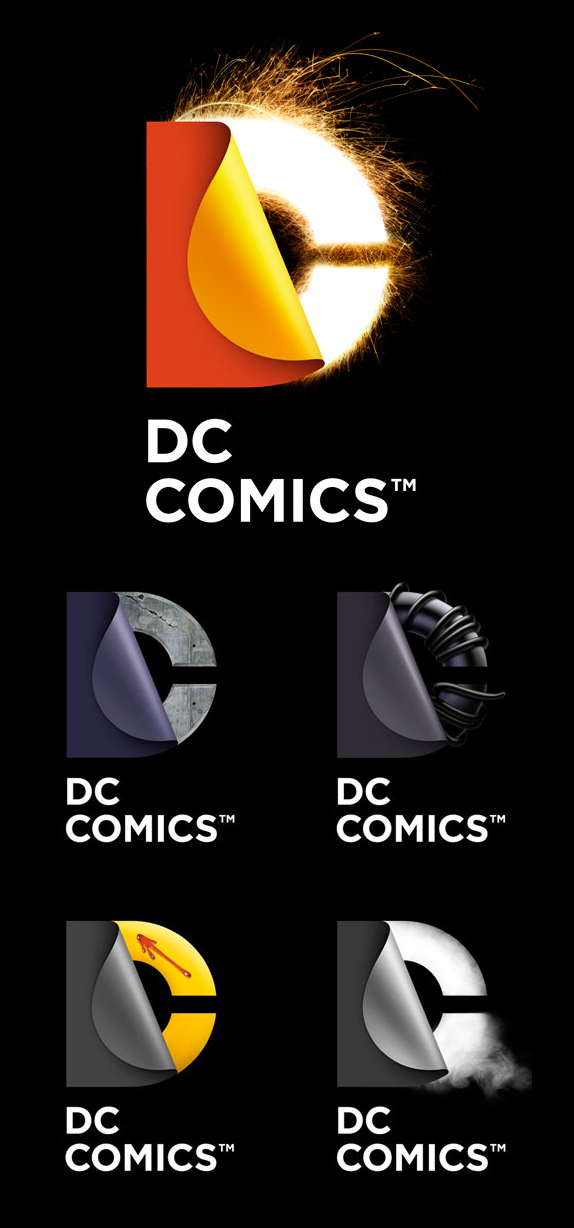
Yesterday, DC Comics officially unveiled its new identity, after the whole internet (including us) stole its thunder at the start of the week when we all judged its new branding effort based on a single, black-and-white rendition of their new logo. Now it's an uphill battle to get people on board with what is actually a fairly good looking and flexible identity designed by Landor.
The design of the new DC Entertainment identity uses a "peel" effect — the D is strategically placed over the C with the upper right-hand portion of the D peeling back to unveil the hidden C — symbolizing the duality of the iconic characters that are present within DC Entertainment's portfolio.
— Press Release


I'll be the first to admit that this is a contagiously exciting identity and to reconsider my stance on not liking it at first. I still think there are some formal deficiencies in the construction of the mark itself and I still feel that the peel effect, as it's executed throughout, has a slightly cheesy, Adobe-Illustrator-gradient-ey feel that for a company with access to some of the best illustrators in the planet could have been avoided. The single-color versions of the logo are also still underwhelming, but when the mark is clad in textures and superhero "stuff" it certainly comes alive and the possibilities for it are pretty endless. The application on comic covers, flush agains the spine and with a more balanced lock-up with the wordmark, is quite nice and elegant, contrasting very well with the mayhem of the cover's artwork.
Overall, the identity manages to redeem the logo.


Thanks to Stephen Hearne for first tip.

Don't forget to cast your vote about this post online
