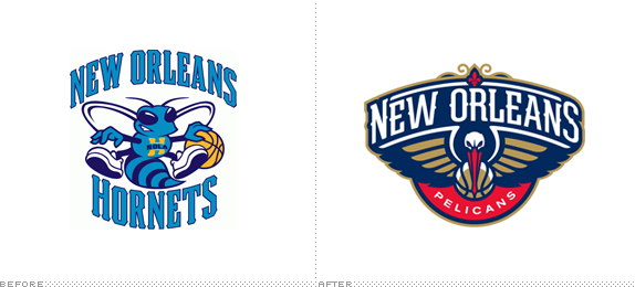
Originally an NBA expansion team in the 1988-89 season in Charlotte, North Carolina, the Hornets moved to New Orleans in the 2001-02 season, with a two-season break spent in Oklahoma City after hurricane Katrina, returning to New Orleans in 2007. In December of 2012 it was announced that the Hornets would change their name to the Pelicans and last week the New Orleans Pelicans unveiled their new identity designed by RARE, self-described as "one of the most esteemed branding agencies in the country." (First time I hear of them).
The Pelicans will be more than a namesake for the franchise, as New Orleans, the State of Louisiana and the Gulf South have a rich history connected to the name. Represented on Louisiana's state flag and seal, the Pelican has been the state bird for over a century. The Pelican symbolizes the determination to not only survive, but thrive even when the odds are stacked against them as our region has demonstrated over and over.
— Press Release


The Pelicans' colors will be blue, gold and red. The team's primary color, blue, is taken from Louisiana's state flag. The Pelicans and Saints will share the color gold, uniting the organizations, while celebrating the spirited life of New Orleans and its many celebrations (gold is also a commonly found color on the "crown" of the pelican). Red represents fraternity and is indicative of the blood provision of the mother pelican and the vibrant color underneath the pelican's throat. All three colors are found on the City of New Orleans flag.
— Press Release
When it was first announced that "Pelicans" would be the name I thought it was a rather silly choice. Not because it didn't make sense — see the first quote and watch the un-embed-able movie at the top here to see why it makes so much sense culturally — but because I didn't consider a pelican to be a rather intimidating animal like other NBA teams a la Bulls, Grizzlies, or even Hornets. Plus, they are rather goofy-looking animals. And perhaps because of those preconceptions the Pelicans had to go with an extremely pissed off pelican, which looks remarkably good. By avoiding a profile shot of the pelican they were able to get past that awkward beak shape and by using a front-view they could also place focus on the wings, which are always a good visual device to work with. The drawing of the main pelican is impeccable: minimal details, bold shapes, and Gestalten-ish. The typography is a nice respite from the pointy serifs of sports logos and is well executed too, although the "N" and "S" look a little wobbly there at the edges.
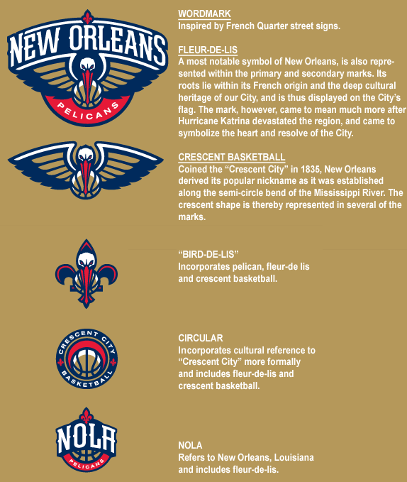
The alternate logos are quite smart too, incorporating a crescent in the circular logo and the fleur-de-lis in the either geniously- or stupidly-named "Bird-de-Lis" which is also both the most awesome thing I've seen this year as well as the most comical. There is something so appealing and repelling about it at the same time.
Overall, a surprisingly different logo within the realm of NBA logos that is city appropriate and looks and feels competitive.


New Orleans Pelicans Logo Unveiling. Photos: Layne Murdoch/NBAE/Getty Images.
Thanks to Juan E. Garcia-Ruiz for first tip.

Don't forget to cast your vote about this post online
