First published in 1894, Billboard is a weekly magazine devoted to the music industry and issuing weekly charts of the top songs, including the popular and industry-leading Hot 100 of the top singles, which then spawned an endless inventory of CDs. This week, Billboard is introducing a redesigned magazine featuring a new logo, both by Pentagram partner Michael Bierut. The new identity will be introduced unto the website on January 26 when it relaunches.
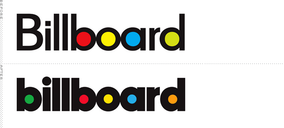
As part of the refresh the logo has been completely redrawn to emphasize the basic geometry of the name, creating a typeface that echoes the circles of the original and still looks "pop." The designers have set the name entirely in lowercase, tightened the spacing and, perhaps most importantly, removed the colors from the circles. This makes the print version look immediately more grown-up and serious, and a lot easier to design with full-bleed color photographs. The color version of the logo will be retained on the new website (designed by Area 17) as well as in retail uses and event marketing.
— Pentagram Case Study

Roll over the logo above to see how pretty the counterspacing looks on its own. (Rollover not an official image release from Pentagram; just something I wanted to point out).
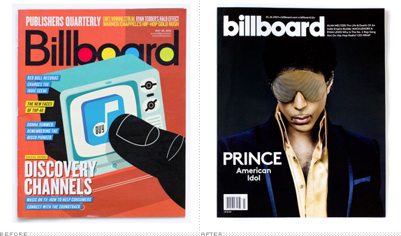
The old logo is one of the most iconic editorial wordmarks for its simplicity and colored dots but both the logo and the idea of a music magazine with charts feel like a relic of another era. I'm really surprised the magazine hasn't been killed and ported all its content and effort online, but their resilience is our gain. The new logo is a great improvement over the old. As I've mentioned once or one hundred times I love me a chunky sans serif and this one is as chunky as it gets and the tight tracking makes it even more attractive. Although I don't always endorse it, I like the change to all lowercase as it balances out the wordmark much better by creating a mirrored effect in the first and last letters as well as bringing a colored dot to the beginning of the wordmark (where previously all were heavily on the right). Another nice detail is the tittle of the "i", which is the same size as the colored dots. The new logo looks good both with colors and only in black as well as inverted on top of Prince (below; editorial design review skipped but the short of it is that it looks great too). Overall, a strong redesign where it was least expected (meaning, Billboard could have just carried on with business as usual but instead chose the more difficult path to upgrade).


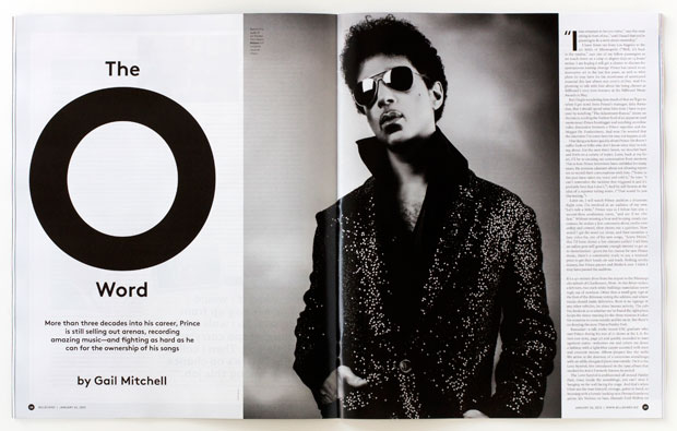
Sample spreads from the redesigned magazine. More here.


Redesign of the magazine's Hot 100 chart.
Thanks to Cory Smith for the tip.

Don't forget to cast your vote about this post online
