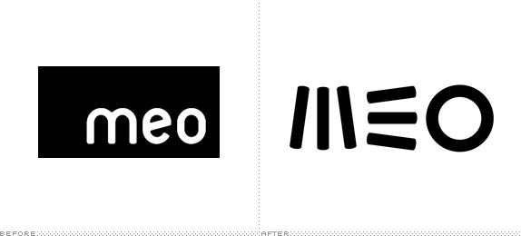
Launched in 2007 by Portugal Telecom, the largest telecommunications service provider in Portugal, MEO is a "triple-play" service provider that offers TV, internet, landline, and mobile phone. This month MEO introduced a new logo designed by Lisboa-based MyBrand (who also designed their previous logo) and tagline, "É Outra Vida" (Another Life).
Thunderous introduction to the new logo. A wider view (and longer reporting in Portuguese can be found here).
The concept behind the new visual identity of the brand "is based on the idea of overcoming," to "encourage consumers to make things differently, make things better for them, better for the world around them, putting people at the heart of innovation." For MyBrand, the new logo has a "great synthesis": "No attempt was with the letters readability, we tried a new language, something that is perceived as new and unique, something inspiring […] In addition, each letter was associated an idea: Community - M; Communication - E; World - O. [Ed.'s Note: Nothing lost in translation, the letters are just associated with the ideas, they are not the first letters of those words in Portuguese.]
— Article on Briefing (Google Translated from Portuguese)


To be perfectly upfront, I wasn't sure this was a remarkable enough story to write a full review about but there is something strangely appealing about the new logo. It is extremely simple without going for the fully geometric straightforward approach that this could have gone in. Instead it creates an interesting tension and balance of its own kind by tilting the sticks of the "M" and "E". I absolutely hate the whole alien language/alien inscription approach that you can see on their website and perpetrated in the video below. I think the same logo could have been taken into a more lively and engaging identity rather than this half-baked sci-fi approach. Just goes to demonstrate how important identity and message is to the logo. (Of course we should all know that but it's good to have reminders now and then).
A rather strange campaign that focuses on the logo as "strange markings" and an American reporter travels to Portugal to understand them. It's long and weird and I wouldn't say it's worth watching other than for curiosity.
Thanks to Bruno Figueiredo for the tip.

Don't forget to cast your vote about this post online


