I always have a hard time introducing destinations so let's just go with a few, simple facts about Bulgaria: located in Southeastern Europe it is the continent's 14th-largest country with more than 7 million habitants and, apropos to this review, welcomes more than 8 million tourists per year. Last week, the Bulgarian Ministry of Economy, Energy and Tourism introduced a new tourism logo designed by Sofia-based Publicis MARC Group that will begin to be used in September 2013.
He expressed hope that the new symbols will make our country competitive and recognizable among foreign tourists. With the introduction of the new brand strategy is expected after 5 years the number of tourists visiting the country, to increase by 25%. There are many elements in the logo, reflecting the capabilities of the Diversity of Bulgaria in the field of tourism Ivo Marinov said.
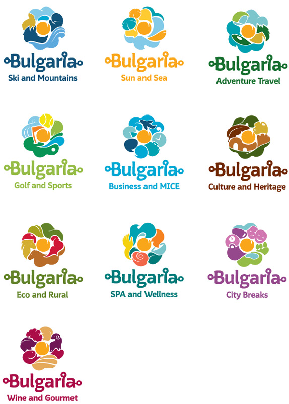
Visual elements of the brand "Bulgaria" integrate symbols of sun and flower. They are arranged in various combinations with other symbols that represent the possibilities of our country as a tourist destination. In addition to national logo and slogan were developed and ten sub-brand for different types of tourism.
— Press Release (Google Translated)


The various logos, animated (sort of).
The old logo, an abstraction of a rose, was rather nice if possibly a thorn in the ass to reproduce since the color changes are so subtle and paint texture is always hard to print properly. The new (main) logo maintains the rose and then adds a bucketful of stuff next to it that aims to capture Bulgaria's natural attractions, from its sandy beaches to its peaky mountain range. The result is painfully clip-art-y, with an overly swirly aesthetic that feels more appropriate for an American water park than a European country. The casual typography with its parenthetical dots doesn't help either. It begins to get interesting with the development of the sub-brands that attempt to capture specific themes within Bulgarian tourism but, unfortunately, the execution fails in most instances, resulting in blobby formations — it's like a bloated version of the Unilever logo. Overall, the idea and approach was interesting but it suffers from lack of graphic sophistication.


Thanks to Ivan Filipov for first tip.

Don't forget to cast your vote about this post online
