Flying used to mean something.
And before People Express Airlines remade air travel into the equivalent of a bus ride, before the mediascape overinformed us about every possible destination, before the security theater of X-rayed shoes, and before the global financial crisis, the experience of flying actually delivered on that promise.
But now, air travel can be a miserable experience. Especially if you fly coach. And especially if you fly American Airlines.
[Ed.'s Note: This is the first time I hand over a "large" review to anyone. Mark Kingsley, a good friend and annoyingly astute observer, asked if he could do it, saying he was "totally excited" about the work. His point of view on this is likely the last thing you expected to hear from Brand New. Enjoy. — Armin Vit]
I've been flying since the late 1970s, from coach on EasyJet to first class on Singapore, from the great American enemies of the 20th Century (Moscow, Berlin, Tokyo) to the great centers of sensuality (Paris, Rome, Cancun). And in that time, American ranked towards the bottom of my personal list of crappy airlines, just above SABENA (which jokingly stands for Such A Bloody Experience, Never Again).
American's fleet is old. Passenger seats shake loose and unbolt in mid-flight. Their employees are completely disgruntled (and happy to kvetch to any random passenger). Their boarding process is painfully byzantine (beginning with First Class and uniformed military; then Business Class, AAdvantage Executive Platinum and oneworld Emerald; followed by AAdvantage Platinum and oneworld Sapphire; then PriorityAAccess, oneworld Ruby and what they classify as Group 1; then Group 2; Group 3; and finally Group 4). The food sucks. Famous novelists, chefs, customers and journalists scold them in public.
And they're bankrupt.
Sounds like a perfect building opportunity.
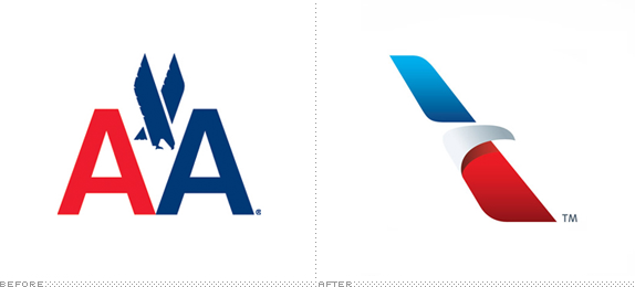
On top of that, they have an iconic logo, dating from 1968 and designed by the beloved and equally iconic Massimo Vignelli.
Sounds like a perfect branding opportunity.
Oh what an opportunity this was. It's been years since such an iconic company went through a rebrand, and perhaps even longer since such a rebrand came burdened with so many cultural and mythic repercussions.
When he made his historic solo Atlantic flight, Charles Lindbergh was an employee of Robertson Aircraft Corporation, one of the many companies which merged in 1934 to become American Airlines. And from there, American frequently was on the cutting edge of employee training (the first flight attendant training facility), information technology (the SABRE system), customer service (Super Saver discounts and the AAdvantage travel awards program), and aeronautic technology.

The history of the American Airlines logo, from left: 1934, 1945, 1962, 1968.
American had the rich history typical of strong brands, as well as a rich cultural mythology.
To rebrand American Airlines was an opportunity to put one of those mythic dents in the universe. This was more than just an airline, this was America itself. As in America, the country that invented aviation.
American is generally how Americans travel between American cities. And in the "Olympic villages" of international airport tarmacs, this was the opportunity to dress the American team. Beyond the outer client-facing symbolism, American also had the opportunity to acknowledge their internal audience and signal positive change for employees as well, through technology upgrades, additional training and increased hiring.
So ultimately, after an intense selection process, FutureBrand was awarded that very opportunity. And they brought their AA-game.
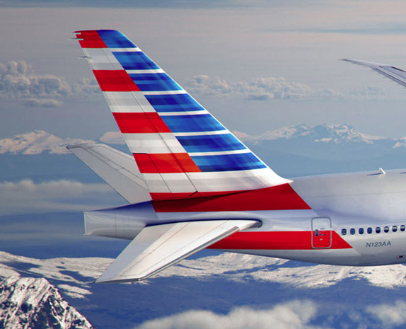
"Our new logo and livery are designed to reflect the passion for progress and the soaring spirit, which is uniquely American," said Virasb Vahidi, American's Chief Commercial Officer. "Our core colors -- red, white and blue -- have been updated to reflect a more vibrant and welcoming spirit. The new tail, with stripes flying proudly, is a bold reflection of American's origin and name. And our new flight symbol, an updated eagle, incorporates the many icons that people have come to associate with American, including the 'A' and the star."
— Press Release
![]()
The result is astounding — see the Becoming a New American launch site. The mark, known internally as the Flight Symbol, deftly manages to honor American's design history and, at the same time, convey a stark, confident modernity which stands among the best symbols anywhere. It does much with very little, in a straightforward way which feels so American. That is… American in the way we like to think America can be.
This arrangement of three simple shapes conveys in the most light-handed way an eagle, a star, the letter A, and a runway. And in a sea of slashes and hash marks, the Flight Symbol plays well in digital space too, making a fine icon at even the lowest resolutions.

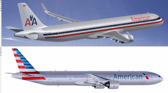
Between the minimalism of the Flight Symbol, the lightness of the typography and the simplicity of the overall grey on the livery, known as the Silver Bird, the cumulative effect is one of spaciousness.


Detail of new livery. (PRNewsFoto/American Airlines). High res and full version here.
In recent years, geographers have begun to think more about the role of space within the process of capitalism. Along the way, they have established that space--as much as time--has been fought over and contested, and that capitalism exploits and creates space in much the same way that it exploits and creates time. In his famous work, The Production of Space, the French philosopher Henri Lefebvre argues that every society produces its own space. In other words, a society's spatial dimensions vary: compare, for instance, the spatial horizons of pre-Columbian Europe with those of today; or, for that matter, those of a child growing up in contemporary rural Angola with those of one growing up in suburban Los Angeles. Lefebvre transforms space from a dead, abstract concept to something alive and dynamic. Far from a neutral blank slate, space, like time--and indeed gender--can be conceptualized as a social construction determined and shaped by human beings.
— Drew Whitelegg, "Working the Skies: The Fast-Paced, Disorienting World of the Flight Attendant," 2007, New York University Press
The great symbol of wealth in modernity is space. Those who have wealth live in great, empty spaces. Those who don't are crammed together.
The space found in the American Airlines identity system feels richer than the previous system and it also reflects the openness of the American west. Again, a light-handed balance between extremes of wealth found in first class and the openness of the mythic average American, who usually flies coach. After listening to CEO Tom Horton's comment that this is "a moment in time when the outside of our aircraft reflects the progress we've made inside," I only hope the improvements made to the first and business class "lie-flat" seats are echoed by additional legroom in coach.

Some of Horton's improvements include tablet devices for customer-facing employees and pilots. All current-generation high-tech objects made with modern materials and processes. But these are easily seen innovations.
Behind the Scenes with the team at Futurebrand and American. Plenty of "physical" applications of the identity can be seen.
Upon watching the "behind the scenes" video (above) there's a point around the 2:30 point where we see several Silver Birds on a tarmac. If you look at the fuselage, there's a matte, almost metallic quality to the silver. There may be an innovative play of materials to that surface. The press release mentions that all the new planes which are being introduced are made of composite materials which need to be painted, in this case with silver mica paint. But whatever's going on, it is a subtle, and decisive gesture.
Extended look at the new livery.
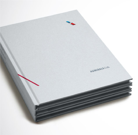
The roll-out of the brand across various touchpoints maintains this feeling of space in an equally elegant fashion. Each move, regardless whether it's signage, menus or social media is consistently refined. But there's one bright spot which has personal appeal. And that is in the updated AAdvantage Card co-brand template.

I spent a few years as the creative lead on the Citi account at Landor, which gave me an introduction to the complex world of co-branded credit cards, their strategies and their design.
Card issuers strike a Faustian bargain when entering co-brand arrangements. You need to strike both a visual and brand balance between both entities, which can be difficult when one logo is clumsier than the other. And honestly, I always had a "slight" prejudice against the previous AAdvantage logo because it felt so ham-fisted, both verbally and visually. But as the proverb says, if you wait by the river long enough, the bodies of your enemies will float by. The heavy type is gone. Now I just have to wait for the name.
But that's a minor quibble to a magnificent achievement.
If ever there was an example of being careful what you wish for, it would be redesigning one of the most iconic and mythologically charged brands in the world. And one with such a famous logo to boot. Both American Airlines and FutureBrand managed to overcome the potential political, financial and personality traps which come with such a huge project.


This is a significant and serious project. There is a lot of crap which accompanies the American iconography of stars and eagles. I've always hated it when hack advertisers trot out George Washington and Abe Lincoln for Presidents' Day promotions. It's the domain of weak and lazy minds happy to turn out client-pleasing treacle. And I've generally hated the maudlin flag waving of Olympic team uniforms.
But to my astonishment, here is a frank and unashamed American logo which feels free of cliché. One that greatly outshines much of the work I hold in the greatest regard — which is generally British or Dutch in origin.
And here is a logo which exposes my confliction about my country. I so love the ideal of America, but am often bitterly sad at our loss of graceful conviction and tolerance. If seeing this work can evoke such a response out of my sarcasm, then imagine what it could do for American Airlines employees and customers. American needed to symbolize a return from irrelevance and a commitment to the long goal. And they were given just that. Now the true work is up to them. For without that internal commitment, all this work could be for naught.
I wish them the temerity to succeed.
National TV launch ad, "Change is in the Air", by McCann Worldgroup. Voiceover by Jon Hamm.

Don't forget to cast your vote about this post online
