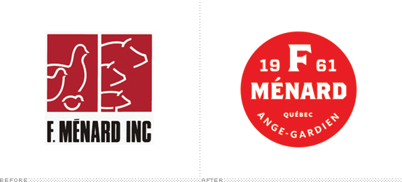
Established in 1961 and based in Ange-Gardien, Canada, F. Menard (in summary) produces pork and poultry products. (In length) it has three distinct operations within the industry: (1) F. Ménard proper, dedicated to the breeding of hogs; (2) Agromex, the "processing" unit (i.e., slaughtering, to the tune of 21,500 pigs per week); and (3) Boucherie 235, a retail butcher shop for consumers in Ange-Gardien. Tying all three operations together, F. Ménard recently introduced a new identity designed by Montréal-based lg2.
The mandate given the agency was, first and foremost, to clarify the company brand which until then had had a distinct name for each of the organization's three specialties: [see intro above]. A Brand Positioning exercise was carried out to find which specific brand could rally all of these units to become a single company — a single brand.
"The brand positioning that emerged following weeks of company analysis was 'Innovating for Quality — A Family Tradition'", said Penelope Fournier, Partner and Director of Design Strategy with the company. This positioning brought together the company's two great strengths: its innovation to provide the marketplace with the best-quality products, while adhering to the founder's greatest value which was honesty. "It was only natural that the name F. Ménard became the official signature that covered breeding, processing and the butcher shop," continued Ms. Fournier.
— Provided Text by lg2
1. F. Ménard Company



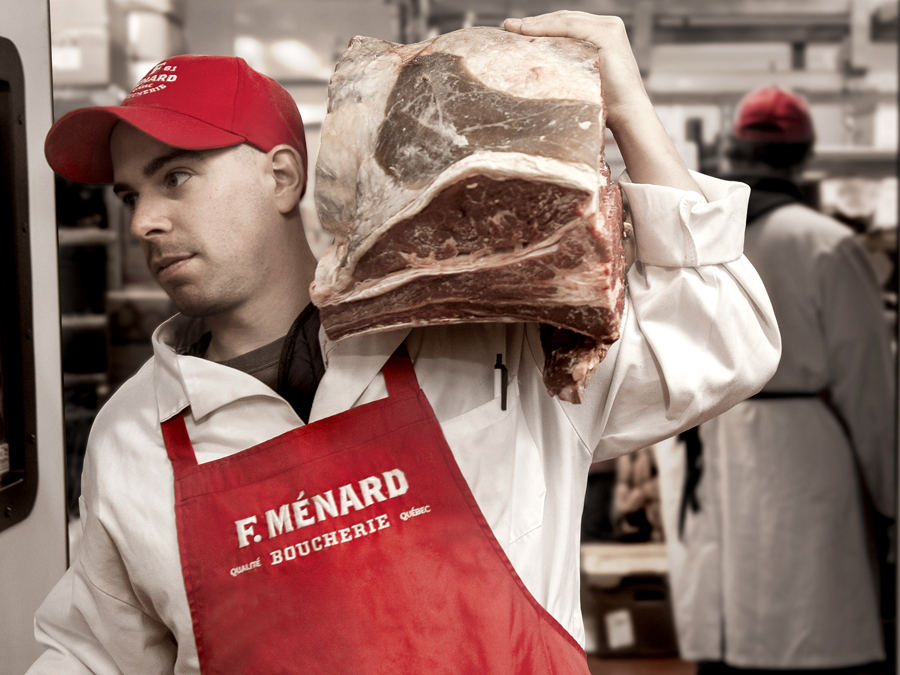
2. F. Ménard Boucherie (formerly Boucherie 235)




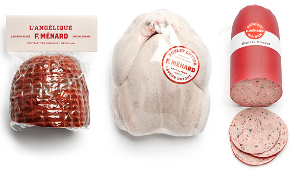
3. F. Ménard Farmer Producer (formerly Agromex)


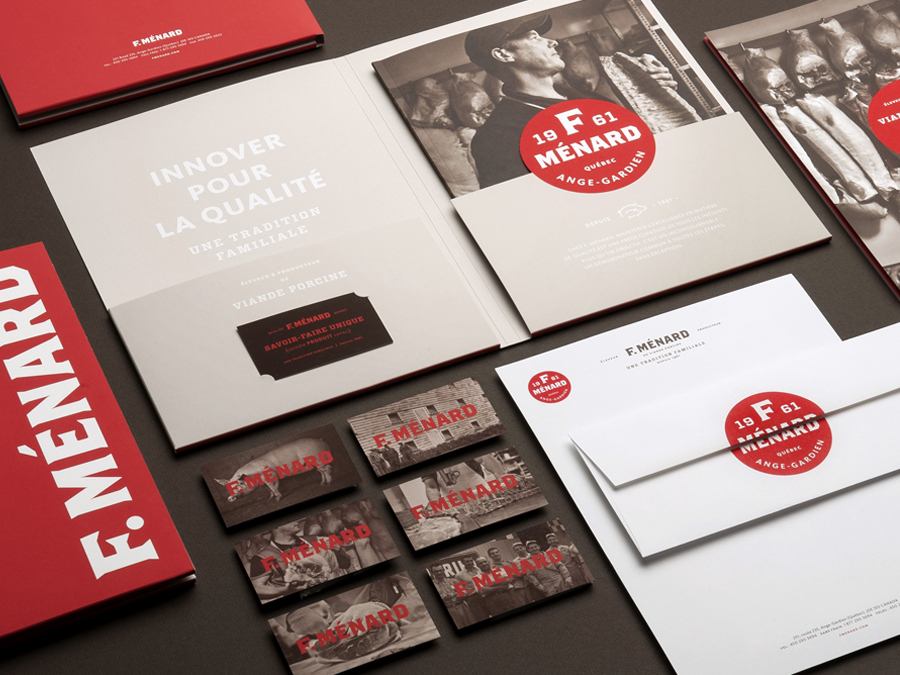
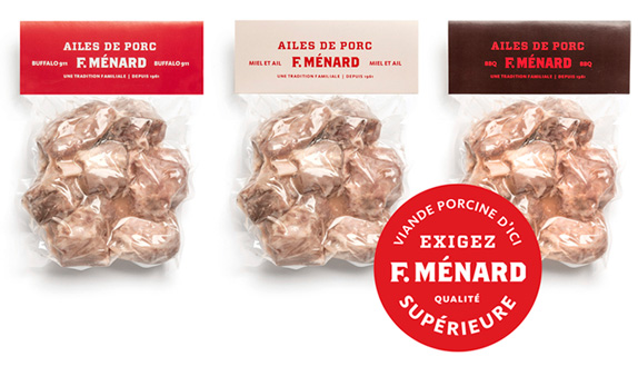
I believe the images speak for themselves so I'll keep my opinion short. Adopting a single, unifying name and umbrella brand — simply "F. Ménard" — makes perfect sense and helps establish — buzzword alert (but used properly) — synergy across the three operations verbally and visually. The chunky, flared serif used for the name, whether stacked inside a circle or set in a single line sets the consistency needed to build the butcher shop and formerly-Agromex logos and applications. The color palette is excellent with red at the forefront and white and brown backgrounds to make it stand out. The typography, photography, and layouts are all wonderfully considered and portray a confident company with a rich heritage.

Don't forget to cast your vote about this post online
