Established in 2004, OzHarvest is an Australian nonprofit organization that rescues food mainly from restaurants, food wholesalers, and retailers to distribute to charities supporting the vulnerable in Sydney, Newcastle, Adelaide, and Brisbane delivering 441,500 meals per month across the country with a fleet of 15 vans. In December OzHarvest introduced a new identity created in a pro-bono collaboration between Frost* and Droga5.

One of the vans currently in circulation.
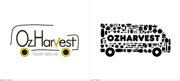
The new mark utilises the distinctive yellow food distribution vans that have become OzHarvest's hallmark, which are picked out in a vehicular shape constructed with scores of images of staple food items. In a cheeky nod to the nature of the services provided by the charity, the identity is realised in the informal, san serif font, Frankfurter.
— Frost* Project Description

The old logo was so naive and helpless you almost wanted to deliver a meal to it and see if that helped any. No point in scrutinizing its shortcomings. The new logo is a great evolution of the original and where Frost* and Droga5 could have said "This logo is shit, nothing can be saved, now get out of our way and let us design something awesome" they built on it, its intention, and the equity of the vans themselves to design something awesome. We've seen logos made out of stuff before so this is not groundbreaking but it's perfectly appropriate, rendering a playful, bold solution that spells out exactly what the organization does. You also have to love the typeface choice, Frankfurter and its relentless use in the annual report below, craftily produced in only two colors. This is pro-bono at its best: a great organization with a desperately crappy logo paired with a collaborative team clearly having fun and producing an effective identity.

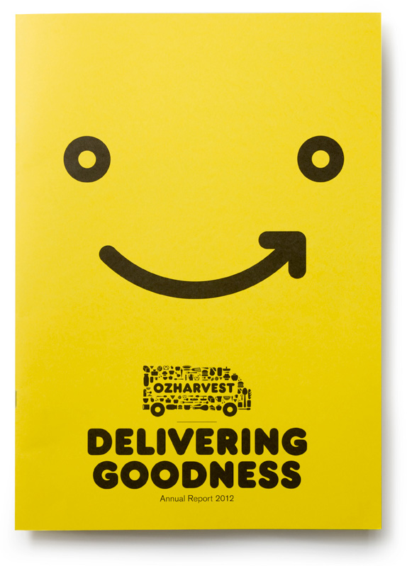
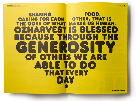
2012 Annual Report.


At OzHarvest's 8th birthday celebration Tall Poppy Collective recreated the logo with actual items like tires and pots and pans. Image cropped, see original and more info here.

Don't forget to cast your vote about this post online
