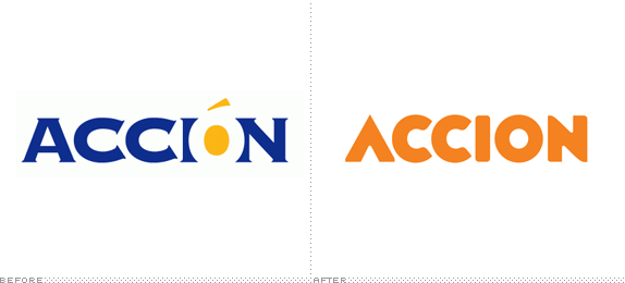
Established in 1961 in 22 small towns in Venezuela to "empower the poor with the knowledge and tools to improve their lives," Accion, a global nonprofit organization, is currently one of the world's leaders in microfinance having established 62 microfinance institutions in 31 countries on four continents that in turn reach millions of clients with loans and support, fulfilling its mission of "giving people the financial tools they need to improve their lives." All the way back in March with a rollout in the middle of the year, Accion introduced a new strategy, established by New York, NY-based IDEON, and new identity, designed by New York-based Joshua Levi.
Going forward, all Accion entities will go to market under the single brand and logo, "Accion." In the past, Accion had used such brands as ACCION International and ACCION USA, and several others.
The new visuals have been designed to acknowledge the organization's rich 50-year history as it moves to a bolder, warmer and more contemporary look […]
— Press Release

[Accion's] needs were addressed by creating a simple, bold, wordmark transforming the capital A into a positive symbol of progress. The final lettering and color took inspiration from one the organization's original posters, designed by its founder, Joseph Blatchford. Independent wordmarks were also created for Chinese offices and for Red Accion, the international network for microfinance based in Bogotá, Colombia.
— Joshua Levi's case study


Dude. That old logo. It just kills me. I know it's Copperplate. Or at least I think it's Copperplate; it doesn't really match up with some of the more common versions. That "A" I have no idea where it came from. The new logo is an extremely welcome change not just because it replaces the old logo but because it's actually an interesting take on the common bold/chunky/friendly look. The "A" obviously becomes an upwards arrow, carrying with it all the positive meanings that it can, but it also helps establish the slightly quirky letterforms that follow. It's not Gotham, it's not Neutraface, it's not Proxima Nova. It is its own strange wordmark with rather strange endings, some flat, some curved. I don't particularly like it but, somehow, it works. It manages to keep some of the grassroots feel on which the company was built and then, in application, it goes full-on buttoned-up NGO with simple layouts, a strict and limited color palette, and a solid and sophisticated combo of slab and sans serif. Overall, I just love it when a nonprofit with an extra crappy identity gets a total makeover for the better as this one does.

Don't forget to cast your vote about this post online
