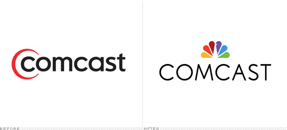
Established in 1963, Comcast is a global media and technology company and it operates two main businesses. The first, and what most people associate the company with, Comcast Cable — although it's not called Comcast Cable, but Xfinity — which is the the largest video, high-speed Internet and phone provider for residential and business use in the U.S. with a combined 50.8 million customers. Under the Comcast name there is also venture capital firm Comcast Ventures and sports and entertainment company Comcast-Spectacor. The other primary business is NBCUniversal, only one of the world's leading media and entertainment companies that manages the namesake television network and movie production company, as well as specialty channels like USA Network, Syfy, E!, CNBC, MSNBC, Bravo, and more. In other words, Comcast is huge and influential. Yesterday, without any fanfare or release, Comcast flipped the switch on a fancy new website that features a new corporate logo.

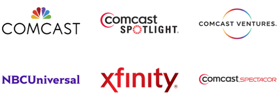
Company logos.
In an extremely surprising move, Comcast has adopted the NBC peacock as its own logo. This is mind-blowing for a number of reasons. (1) When NBCUniversal redesigned, the decision was made that this corporate mark should have neither the peacock nor Universal's globe; a decision I commended and still do; and now you have a corporate name that doesn't even include the word NBC and there, like a crown, it sits on top of Comcast. It's impossible to look at the peacock and NOT think NBC, forcing you to read the logo as NBCComcast. (2) Moving the peacock into corporate territory where it now becomes an ambassador for a technician making you wait at home for a window of 4 hours to repair your cable or internet connection is absolutely counterproductive: The NBC peacock logo should stand for television entertainment alone and focus on elbowing its way back into its equally iconic networks logos and their ongoing rivalries. Diluting that brand — which stands for Today, the Olympics coverage, The Voice (hey, I don't make the ratings), Parks and Recreation and all the way back to Seinfeld and Friends— in favor of corporate appearances feels like a mistake. And (3) just look at the Comcast logo and name line-up below: This is one of the most confusing brand architectures where names and logos are crudely interchangeable — it makes Mr. Potato Head look organized.

On the logo itself… Well, it's not terrible. There is the NBC logo, which is nice, we all know that, and in relationship to the name, it's just the right size. The wordmark follows on the footsteps of NBCUniversal (which is half serif and half sans serif) by being half hard-edged in its terminals and half rounded (i.e., the "C" starts rounded but ends flat). It's a weird thing to do, as it creates an uneven visual effect once you notice it. Conceptually, I can see how it might represent the two aspects of its business, but visually it's just odd and looks unfinished.
Overall, a head-scratcher. A real head-scratcher.
Thanks to Scott Lederer for first tip.

Don't forget to cast your vote about this post online
