Just launched by SKY New Zealand and Television New Zealand, IGLOO is a "digital set top box that plugs into your telly and broadcasts through your UHF aerial" giving users in New Zealand access to free-to-air channels and, its main hook, a pre-paid range of premium channels without long-term contracts, going on a month-to-month basis with only the channels you want and not bloated packages with channels no one watches. The name, brand, and roll-out have been created by Interbrand Australia.
Update: I have changed the title of the post (originally "Not your Eskimos' Igloo" (as a play on "Not your parents' this or that)) as I was not aware that Eskimo is considered a pejorative term. Apologies to anyone who thought of it as offensive; it wasn't my intention.
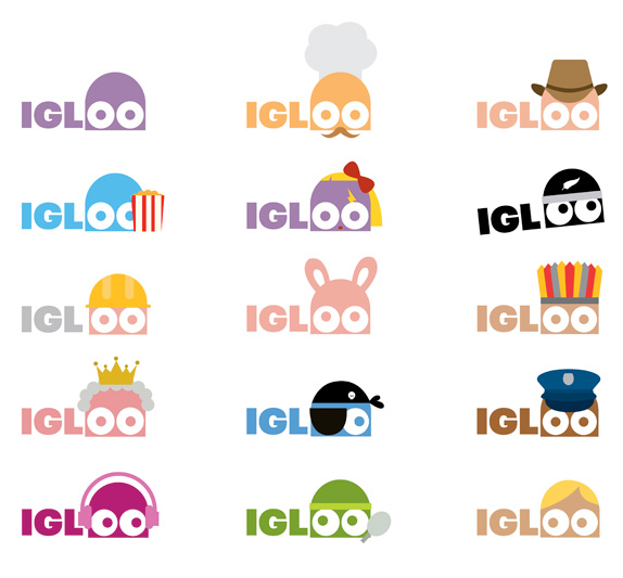
"IGLOOs are colourful characters that love to dress up as their favourite stars. We also created a distinctive verbal identity for IGLOO, which is witty, irreverent, and distinctly Kiwi. IGLOOs even have their own language called 'IGLISH' which consists of any word with double O in it," Said Rigby and Maclean.
The IGLOO creatures provide several useful roles throughout the brand experience. From entertaining you, to explaining the various package options through to helping to make the set up process easy and fun. The whole brand revolves around ease of use, entertainment and fun".
— Interbrand Case Study


Introduction to the IGLOOS.
IGLOOS, animated.


Set top packaging.
Well, this is fun. And simple. And bold. All qualities that tend to get me to like things. The logo is a great launchpad for the little IGLOO character with the "OO" in the name serving as the eyes for this Pac-Man-slash-Despicable Me-Minion hybrid. The typography is perfectly tuned with the cartoonish look and the two elements — the characters and the distinct typography in the copy-heavy ads and website — work very well together to establish the brand personality. At times both the copywriting and the IGLOOs feel a little too clever or like they are trying too hard to appear cool and friendly, so maybe a little tapering into something more "normal" will serve the product well if they want to appear more like a long-term product than a flashy gizmo that may run its course early. Nonetheless, as you can see in the applications below, the adaptability of the language and IGLOOs create an unexpectedly pleasant identity in the otherwise corporate world of paid cable aesthetics.
![]()


Stationery.

Samples of the "Iglish" language.


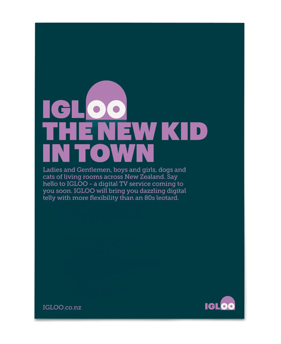
Sample ads and tone of voice.


The mute button (upper left) says "shhh".

Don't forget to cast your vote about this post online
