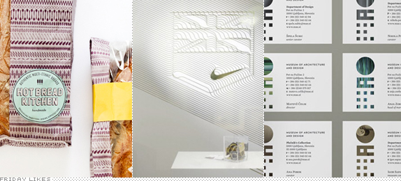
One might deduce that I have a thing for patterned and textural identities. One might be right. Work spanning bread, shoes and apparel, and design and architecture all get a sophisticated-over-the-top treatment in this week's Likes.
Hot Bread Kitchen

There is nothing more heartwarming than an altruistic organization getting a great makeover — except maybe bread out of the oven. This project has both things going for it. Hot Bread Kitchen in New York "employs and empowers immigrant and low-income women in the art of making and selling bread" and "provides paid on-the-job training and produces breads inspired by its bakers and the countries they come from". While the breads have always looked delicious, their old logo did not. Pentagram partner Abbott Miller has created a fantastic line of packaging that uses a tight pattern of 28 ingredients and tools used in the bread-making process, from seeds to spoons to eggs. The breads, peeking through a clear plastic slice in the bag look extra delicious surrounded by the patterns. The logo and bread name typography, while not as flashy, have a fun, gradient-less shadow device going on. [More].

Nike London 2012 Retailer Hospitality

Making a second appearance on Friday Likes (see FL15) Nike designer Darrin Crescenzi brings us a "script-driven digital interpretation" of a previously designed logo for Nike London Retailer Hospitality, an event at the London Olympics to showcase "the latest Nike products, retail philosophies and innovative brand stories to its retail partners". I love how the lines connect into and out of the Nike logo to form the shield/flag logo. Plus the whole thing is dipped in 14 karats of gold. Not really, just metallic PMS probably. A very nice balance of techie and sophistication. [More]

Museum of Architecture and Design

Located in Ljubljana, Slovenia, The Museum of Architecture and Design (Muzej za Arhitekturo in Oblikovanje in Slavic) showcases "different objects, from plans, sketches, and models for buildings to various kinds of furniture, small objects, instruments andappliances, posters, other printed materials, and photographs." It also has a sweet logo designed by local firm ilovarstritar that features all the accoutrements of a contemporary design museum; mainly an acronym set in some kind of geometric shapes and using the logo-as-window device. The positive is that these ingredients are perfectly executed and I love how the logo goes from a loose abstract "M" to a solid "O". The logo is also flexible in that it can change how the basic shapes are constructed or rendered and it can be quite successful at times. [More]

Don't forget to cast your vote about this post online
