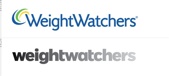
Established in 1963, Weight Watchers is the world's leading provider of weight management services through a points system that assigns a number to each different food and caps your intake at a certain amount of points — so, say, you can eat 10 points a day, you can spend them on steamed chicken, broccoli, and wheat rice, or you could just eat a fucking doughnut. It's more complex than that (and you can read a great article on Wired about how their point system has evolved). There are approximately 1.3 million members around the world who attend a whopping 45,000 combined meetings each week through a network of company-owned and franchise operations. Additionally, Weight Watchers produces its own branded food products, consumed at a rate of $5 billion last year. Earlier this month, Weight Watchers launched a new program called Weight Watchers 360° and with it came a new identity designed by Pentagram partner Paula Scher.
As part of the program overhaul and looking forward to the next 50 years, Weight Watchers also gave its brand a new, highly modern visual system that brings to life the transformation members experience when they adopt a new lifestyle that can lead to significant weight loss.
— Weight Watchers Press Release

Monogram version.
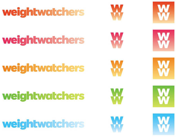
The new identity features a friendly, accessible logotype with the Weight Watchers name set in lowercase. The logotype appears in a gradient that visibly lightens from left to right, embodying the idea of transformation and losing weight. […] Gradation is an essential element of the entire program, symbolizing change. In addition to the grayscale gradient of the primary logotype, the gradation appears in the primary palette of five bright, bold colors. In horizontal elements, the gradation appears from left to right; in vertical elements like logomark, from top to bottom. The transition may also use multiple colors, appearing as a dual gradation, but always moving from dark to light.
— Pentagram case study.
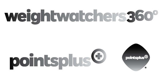
Logos for the Weight Watchers 360° and PointsPlus programs.

Other stuff, in gradients.
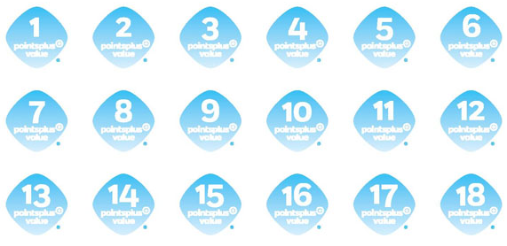
The infamous point system.
The old logo wasn't anything terribly exciting and despite its triple-swoosh it wasn't as annoying as one would expect; perhaps because of the more dead-serious typography that gave it a clinical look. The new logo and identity represent Weight Watcher's effort to an "integrated marketing and communications strategy to position the company as a lifestyle brand." In contrast with the old logo and in tune with today's friendly-tization of corporate wordmarks, the new logo meets all the qualifications — lowercase, rounded, huggable — for a more consumer-friendly mark. Based on Jeremy Mickel's Fort type family, the new wordmark extends from here into the next block with a very horizontal presence; it's a nice, long wordmark, very nicely spaced, especially with the left-handed trimming of the crossbar of the "t" giving the counterspaces a great rhythm that you can only achieve with long names. But then there is the gradient. It signifies transformation. Sorry, but no. Transformation means change. Dramatic change. If you were to read into the wordmark and its gradient you would see the same bold (fat!) letters just dressed in different shades of gray but it's still the same "structure" underneath. I'm not saying the solution is the obvious heavy-letters-to-ultra-light-letters wordmark — see yesterday's post about obvious— but for someone as typographically and metaphorically gifted as Scher I really doubt that a gradient was the best possible way to communicate transformation. Were there more daring options presented? I'm pretty sure. Was this the safest? Most likely.
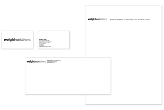
So if you like gradients, this identity is for you. If you don't, then it's a drag. I think there is a point where you have to stop with the gradients. This is gradients on every single thing. And while it works and would be a distinguishable trait on the main wordmark — where its length at least allows for a loooong, stretched out gradient (see the stationery as an example of how nice it actually does look once you get past gradient preconceptions) as opposed to how clunky it looks on the WW monogram — putting it on every trademarked or servicemarked word that comes out of Weight Watchers it becomes repetitive and expected. Where the idea of the gradient works best, and actually looks really nice, is when it's from one color to another, as seen in the printed material below against stark white backgrounds and the logo in color.
Overall, it's a nice upgrade, especially when it comes to application. But the gradient as transformation is just not something I buy into.
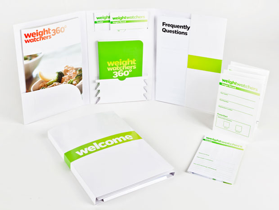

Welcome kit and enrollment books.

Don't forget to cast your vote about this post online
