I originally posted about Rebel in the B-Side on Monday, which I thought was an interesting redesign but there wasn't much info about it. At the end of the day I had more info. To recap who Rebel is: Established in 1985 with a single store in Bankstown, NSW, Rebel— retailer of sporting and leisure equipment, apparel and footwear — now has 90 stores across Australia with over 4,500 employees and by the end of 2017 they aim to have over 180 stores open. The new identity started appearing in November and now is in full swing. It was designed by Sydney-based Hulsbosch and the retail store and interiors by neighboring firm McCartney Design.

Hulsbosch has created a distinctive and inspiring brand for Rebel for both its retail and online operations with the aim of repositioning the business as Australia's premium sports retailer of choice. Rebel aims to increase its market share of active sports enthusiasts seeking quality equipment and sportswear, to grow its female demographic and to cement brand loyalty with its existing customer base. The brand program has a strong focus on clear, simple and confident messaging that translates to a relevant and inspirational brand offer.
[…]
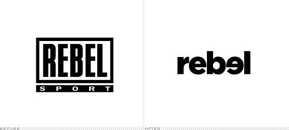
The word "Sport" has been dropped from the identity taking advantage of the high brand awareness enjoyed by the Rebel name, while the flipped "e" intends to communicate healthy competition either against another person and/or oneself to promote the idea of personal best.
— Press Release


Process/result video.
Click image to see bigger version.


The first of its flagship stores, in Sydney's Northern suburb of Brookvale.
The old logo probably had a good deal of equity as Rebel grew in popularity and ubiquity but, let's face it, there isn't much to it. I like condensed sans serifs in a stroked rectangle as much as the next guy, but there are plenty of those to go around. The new logo is not significantly different from other bold, lowercase logos of today either, but it has its own unique quirk and distinguishing characteristic in the flipped "e". Groundbreaking it is not. As students we either did or saw someone else do a very similar solution. It's an obvious one. And I think that's what makes this identity interesting for discussion: when is the obvious design solution detrimental to the company, product, or service it represents? As opposed to when is the obvious design solution detrimental to the whims of graphic designers around the world? Yes, we could have all sort of arrived at a similar solution — and may even scrap it altogether after sketching it for fear of being obvious or simplistic — but sometimes this kind of broad answer to a visual problem is exactly what an identity needs. I may roll my eyes at the flipped "e" but the everyday miss Yoga Mom or mister Cricket Wannabe will find a certain pleasure in making the connection between the name and the rebellious "e". So, in short, this new logo works: it's bold, it's memorable, and it's distinguishable. I just wish it didn't butt heads like two American football players as shown at the end of the video above. That is dumb.
In application there is also a nice twist of the b-flipped-e becoming the word "be" where motivational catchphrases can be used to give meaning to the pretty people in the black and white photography. Yellow and black is always a winning combination and it's a palette used well throughout the identity. All they need now is better commercials (see below).
Christmas commercial with new logo. Not done by Hulsbosch. And, wow, that's bad copywriting and acting.

Don't forget to cast your vote about this post online

