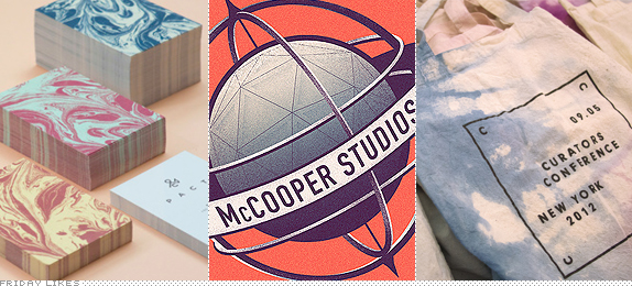
The trend this week in work coming in from Singapore, Porto, and New York is subtle, luscious patterns and soft color palettes. Better get on the trend, y'all, before it gets tired.
PACT

If you ever wanted to have a gourmet meal, shop for fine clothing, and get a stylish haircut all in the same place then you need to head to PACT at the Orchard Central in Singapore — see some Foursquare pics here— where Kilo restaurant, the K.I.N fashion line, and multi-location hair salon LIM await you. Designed by Singapore-based ACRE, the identity is described thusly: "We first went about designing a unifying element with the use of the ampersand (&) symbol, altering its structure to spell 'PACT'. The ampersand celebrates partnerships and is positive about the likelihood of future collaborations. The design execution of marbling was chosen to depict three dissimilar businesses coming together to form a single-minded entity. The swirls and mix of marbling underlines the brand's reflexive yet determined vision of celebrating partnerships." I would label this identity as Zen Chic. [More].

McCooper Studios

The brief by the client, German photographer McCooper Studios, included: "Being a photography studio with a special touch in Sci-fi with a great background in cinema, the special request to design the brand had a great influence in the golden era of steampunk with a Nasa twist." Almost as hard as landing a rover on Mars. Porto, Portugal-based Royal Studio delivered a lovely modern-vintage logo that is not afraid to be detailed and ornate, looking great in full color but also working perfectly as a single-color application on a fantastic range of black-gold-and-gray print items. [More]

Curators Conference

For the inaugural Curators Conference in New York, local firm RoAndCo drenched an otherwise stark black-and-white identity in pinks, blues, and purples of watercolor goodness. Without the watercolor effects, one could argue, the identity isn't much but that's exactly why it works: its spareness is a perfect canvas for the subtle colors. I love how the tote bags are all different and how the textures are contained within the hard edges of the program. A great contrast between computer-y typography and a handcrafted element. [More]

Don't forget to cast your vote about this post online
